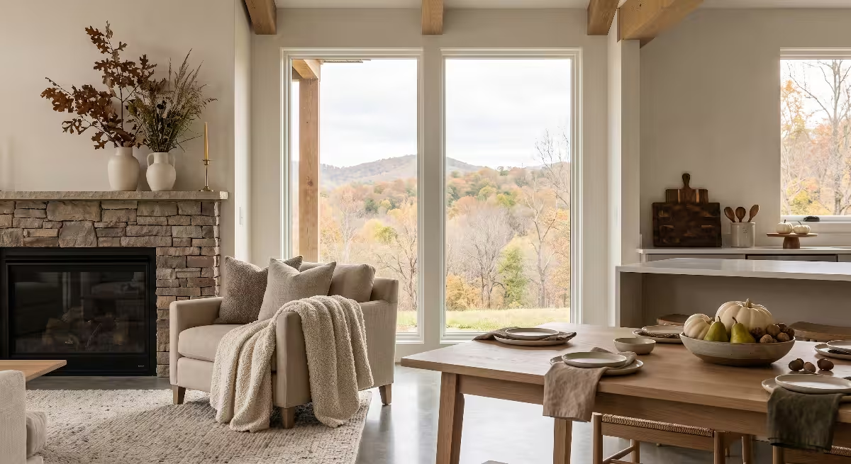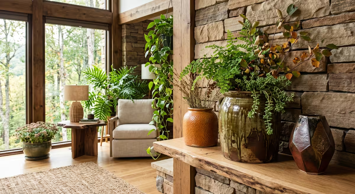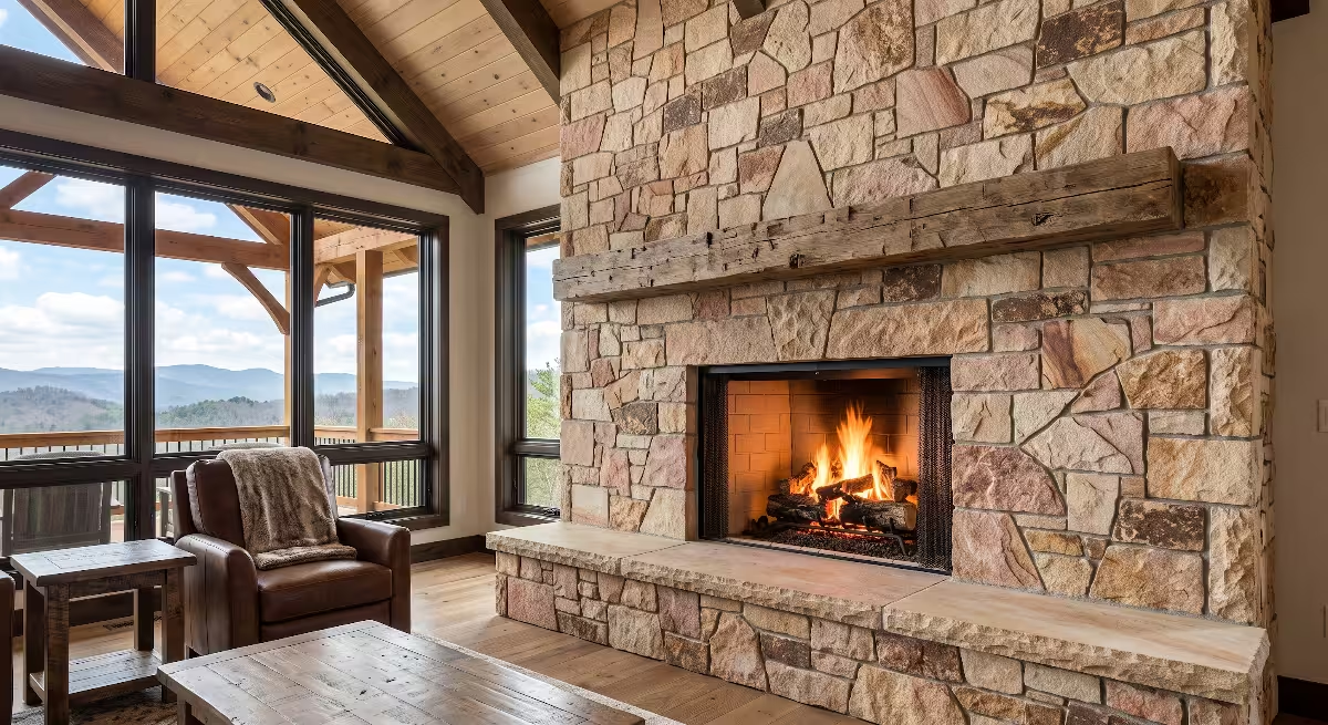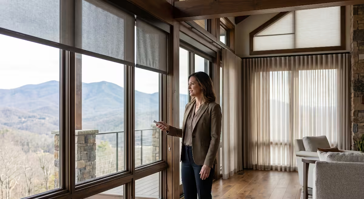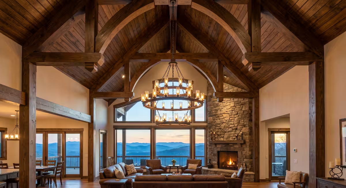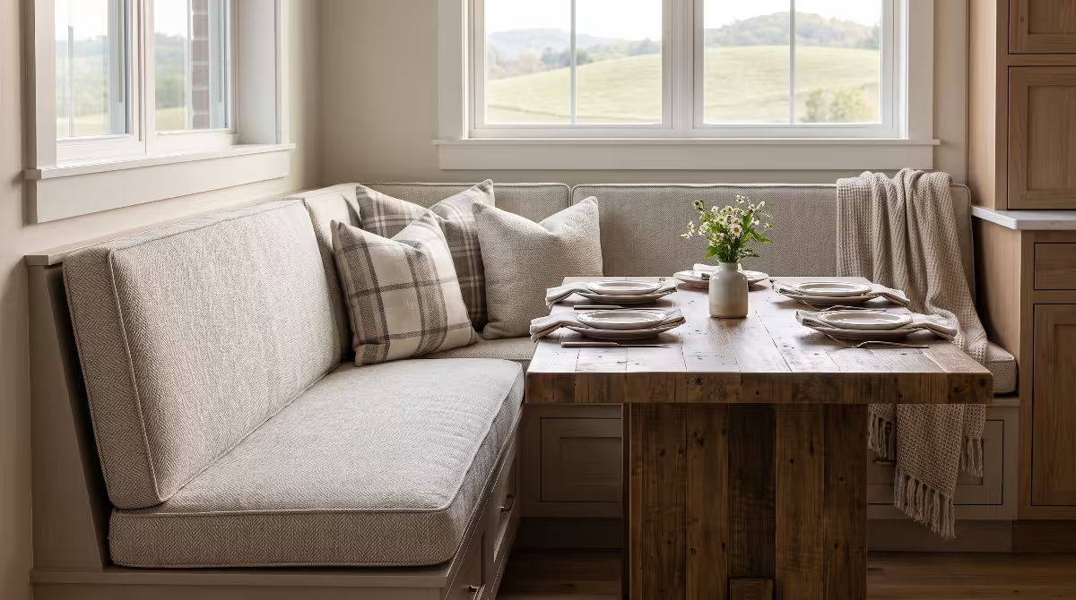


Welcome to the transition season. Here in the rolling hills of the Tri-Cities, from Kingsport down to Johnson City and across to Bristol, early fall brings a quiet, beautiful shift. The bright, high-energy summer days begin to soften into cool mornings, golden afternoon light, and crisp mountain evenings. When you build or design a home, you quickly learn that a house should never feel disconnected from what is happening right outside its windows. Your interior should welcome each season with purpose, balance, and thoughtful planning.
When many homeowners think about autumn decorating, they immediately picture bright orange pumpkins, dark November rusts, and plastic Halloween decor. But a true modern farmhouse calls for something much more refined. Creating successful fall color palettes means knowing how to introduce warmth, organic texture, and grounded color while keeping the clean lines and open feel of a custom home.
Whether you are finishing construction on a new home or refreshing your current living space, this comprehensive guide walks you through every layer of seasonal styling. We will explore how to transition smoothly, build proper neutral base layers, choose sophisticated color schemes, style key rooms, and pick the best materials and lighting.
The Art of the Early Fall Shift
The seasonal transition from late summer to early fall requires a gentle hand. In August and September, the days are still warm, but the angle of the sun begins to change. The blinding whites and cool blues of summer suddenly feel a bit too sharp against the changing landscape. However, pulling out heavy blankets, dark browns, and spooky decorations too early feels rushed and heavy.
A successful seasonal shift is about capturing early harvest tones. Think of sun-dried grasses, early golden apples, warm stoneware, and soft orchard greens. When you look at natural fall color palettes, you notice that nature does not change overnight. Leaves turn in stages, starting with subtle yellows and soft ambers before shifting into deep reds. Your home should reflect that same steady rhythm.
Modern farmhouse philosophy has always centered on simplicity, honesty of materials, and everyday function. It takes the hard-working soul of traditional rural homes and pairs it with modern architectural clarity. A modern farmhouse avoids fussiness and clutter. Instead, it relies on structural warmth, natural light, and authentic surfaces like tongue-and-groove paneling, exposed beams, and wide plank flooring.
When planning fall color palettes for modern farmhouse interiors, the core intent is to layer subtle, grounding pigments into bright rooms. You want to introduce dried botanicals, sun-bleached terracotta, and muted olive green without losing the airy feel you love. The goal is understated comfort that honors both the architecture of your house and the beauty of early autumn.
Foundational Base Layers: Evolving Beyond Stark White and Cool Gray
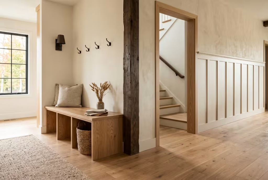
Every great room starts with its base layers. For years, design trends leaned heavily on cool grays and stark, bright whites. While those tones offered a clean slate, they often felt chilly, especially during the cooler months in East Tennessee. A modern farmhouse thrives when the foundation is warm, inviting, and layered with intention.
Warm Neutral Underpinnings
To make fall color palettes truly shine, you need a backdrop that supports them. Stark whites with blue or purple undertones make warm autumn accents look misplaced or jarring. Moving toward warm neutral underpinnings creates a seamless bridge between your permanent fixtures and your seasonal accents.
Look for paint shades that feature creamy, gentle undertones. Shades of alabaster, natural linen, soft oat, and gentle greige create a calm foundation. Greige blends the crisp structure of gray with the earthy comfort of beige. When you paint your walls with a warm neutral, your trim, cabinetry, and furniture feel softer and more grounded. These neutral backdrops allow early fall color palettes to settle into the space naturally rather than fighting for attention against cold walls.
Light Reflectance Value Considerations
Homeowners should always to pay attention to
In custom homes with open floor plans and large windows, natural daylight changes dramatically as the sun drops lower in the sky during early fall. A wall color with an LRV that looks bright and clean in July can feel flat or shadow-heavy by late September. When selecting wall paints to complement fall color palettes, aim for warm neutrals with an LRV between 70 and 82. This range reflects plenty of natural light to keep the home open and cheerful, while carrying enough warm pigment to avoid looking gray or washed out on cloudy autumn days.
Wood Tone Integration
Wood is the anchor of any modern farmhouse interior. It brings the outdoors inside and adds structural warmth that paint alone cannot provide. To build a foundation that complements seasonal fall color palettes, pay close attention to your wood tones.
Natural white oak is a staple of modern home design for good reason. Its light, honeyed grain provides neutral warmth without orange or yellow undertones. Pairing white oak floors or island cabinetry with raw maple accents and reclaimed walnut ceiling beams creates architectural depth. When you introduce fall color palettes into rooms with layered wood tones, the colors connect immediately with the natural grain of the wood. The wood serves as a living neutral that ties your paints, fabrics, and decorative pieces together into one cohesive design.
Curated Palettes: 4 Distinct Early Fall Color Schemes
Selecting a color scheme for your home should never feel like guesswork. To help you plan your spaces, here are four distinct fall color palettes designed specifically for modern farmhouse living. Each scheme balances warmth, clarity, and organic charm.
| Palette Name | Primary Tones | Supporting Accents | Modern Farmhouse Hardware & Materials | Best Rooms for Application |
| Sun-Baked Harvest | Terracotta, Warm Amber | Parchment White, Matte Black | Cognac leather, glazed stoneware, blackened iron | Great Room, Dining Room, Kitchen |
| Faded Orchard & Sage | Muted Olive, Sagebrush | Mustard Seed, Soft Cream | Antique brass, aged pewter, raw white oak | Kitchen, Butler’s Pantry, Screened Porch |
| Smokey Hearth & Heather | Charcoal, Warm Taupe | Dusty Plum, Antiqued Brass | Cotton velvet, honed soapstone, dark steel | Primary Bedroom, Den, Library |
| Golden Field & Wheat | Raw Umber, Dried Flax | Bleached Wheat, Ironstone | Chunky wool, woven seagrass, matte cream ceramic | Entryway, Living Room, Guest Suite |
Palette 1: Sun-Baked Harvest (The Warm Earth Direction)
The Sun-Baked Harvest palette draws direct inspiration from late-season gardens and sun-warmed clay. This palette avoids bright synthetic oranges in favor of sun-bleached terracotta, aged amber, soft parchment white, and crisp matte black accents.
Terracotta brings an ancient, handmade quality that suits farmhouse architecture perfectly. When paired with the deep golden hue of amber, it feels like early afternoon sunlight captured inside the home. Parchment white keeps the overall look light and breezy, while touches of matte black provide the sharp modern contrast that defines modern farmhouse style.
To apply this scheme, bring in glazed ceramic crocks filled with dried grasses on your kitchen counters. Place a brushed linen throw in a soft clay tone over a neutral slipcovered sofa. If you have an open kitchen island, cognac leather barstools offer rich color, durable seating, and a classic texture that deepens this warm look.
Palette 2: Faded Orchard and Sage (The Botanical Direction)
If you prefer cooler, softer transitions, the Faded Orchard and Sage palette is a wonderful choice. This botanical direction focuses on muted olive, dusty sagebrush, warm cream, and small hints of mustard seed yellow.
Green is nature’s favorite neutral. Muted greens echo the fading foliage of apple orchards and mountain ridges in early autumn. By pairing sage and olive with a warm cream base, the space feels tranquil, fresh, and grounded. The gentle punch of mustard seed adds just enough golden warmth to evoke harvest season without overpowering the room.
You can bring this palette to life by placing freshly clipped olive or eucalyptus branches in large vintage stoneware vessels. If you are building or remodeling, consider a soft sage finish for your kitchen island or mudroom storage lockers. Add botanical block-print linen pillows to your armchairs to introduce subtle pattern while staying true to organic farmhouse roots.
Palette 3: Smokey Hearth and Heather (The Moody Transitional Direction)
For those who love spaces with depth and intimacy, the Smokey Hearth and Heather palette provides a sophisticated, moody option. It combines rich charcoal, warm taupe, dusty plum or fig, and unlacquered brass.
Many people hesitate to use dark colors, but when balanced with warm taupe, charcoal feels comforting rather than cave-like. The addition of dusty plum offers a rich harvest tone that feels luxurious and historic. This combination creates an inviting, fireside atmosphere that makes open living areas feel cozy.
Incorporate this palette through soft, washed velvet accent pillows on a sectional sofa. Use dark bronze or charcoal window sashes to frame exterior views of turning leaves. Unlacquered brass cabinet hardware, wall sconces, and picture frames introduce a glowing metallic note that brightens the deeper hues.
Palette 4: Golden Field and Wheat (The Minimalist Organic Direction)
If you love a calm, tone-on-tone aesthetic, the Golden Field and Wheat palette is ideal. This palette relies on raw umber, dried flax, bleached wheat, and ironstone white. It focuses on texture and tonal shifts rather than high-contrast colors.
This approach celebrates the simplicity of early grain harvests. It feels relaxed, clean, and restorative. By working with different shades of tan, beige, cream, and soft brown, you create a space that feels bright while wrapping the room in physical warmth.
To make this minimalist palette succeed, layer varied textures throughout the space. Combine chunky knit wool blankets with smooth ironstone pitchers. Add woven seagrass baskets to hold extra pillows, and display collections of matte ceramic vessels on open shelving. The interplay of rough and smooth materials gives this neutral palette rich personality and comfort.
Room-by-Room Material Application and Styling
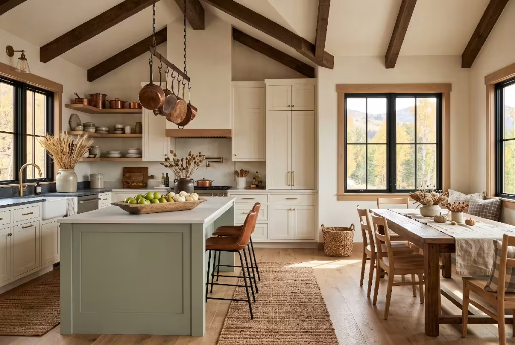
Applying your chosen fall color palettes across your entire home requires a room-by-room strategy. Rather than placing autumn accents randomly, look at how each room functions and how color can enhance its daily purpose.
The Modern Farmhouse Kitchen
The kitchen is the command center and gathering hub of the modern farmhouse. Because kitchens contain many hard, fixed surfaces like quartz countertops, tile backsplashes, and stainless steel appliances, seasonal shifts should focus on functional textiles, natural items, and movable accents.
+-------------------------------------------------------------+
|               MODERN FARMHOUSE KITCHEN ISLAND               |
|                                                             |
|       [ Cognac Leather Stools with Black Iron Legs ]        |
|                                                             |
|   +-----------------------------------------------------+   |
|   |  Textured Runner: Jute & Terracotta Woven Fibers    |   |
|   +-----------------------------------------------------+   |
|                              |                              |
|          +-------------------+-------------------+          |
|          |                                       |          |
|   [ Vintage Stoneware Crock ]             [ Wooden Trough Bowl ]
|   - Dried Wheat & Rye Stems               - Green Apples & Pears
|   - Sun-Bleached Neutral Tones            - Natural Harvest Color
+-------------------------------------------------------------+
Start by swapping out your lightweight summer floor runners for textiles featuring richer weaves and tones from your fall color palettes. A hand-knotted wool or flat-weave jute runner with terracotta, olive, or warm amber stripes immediately grounds the cooking area.
On open shelving, rotate everyday dinnerware to highlight handmade stoneware crocks and earthenware bowls. Displaying your copper cookware brings in a warm metallic glow that reflects light and complements harvest colors. On the kitchen island, set out a wide, hand-carved wooden bowl filled with locally grown green heirloom apples, seckel pears, or small white gourds. These simple touches introduce real harvest elements without feeling artificial or cluttered.
Living Room and Hearth
The living room hearth is the emotional heart of the home as temperatures cool. It is the place where family gathers to read, talk, and relax. Designing this space around early fall color palettes creates an atmosphere of rest and hospitality.
Begin with your textiles. Pack away light linen and crisp cotton slipcovers and pillow covers. Replace them with tactile fabrics like chunky bouclé, textured waffle weaves, and brushed wool twill. Layer three or four pillows in varying shades of your chosen palette on the sofa. For instance, if you are using the Sun-Baked Harvest palette, pair a large parchment linen pillow with an amber waffle-weave pillow and a smaller terracotta lumbar pillow.
When styling your fireplace mantel, avoid overcrowded displays of fake foliage. Instead, embrace an asymmetrical, organic approach. Place a single large earthenware vase on one side of the mantel filled with dried branches or tall wild grasses. On the other side, balance the arrangement with a cluster of brass candlesticks holding pure beeswax taper candles. The golden honey hue of natural beeswax fits beautifully into any autumn palette while providing a gentle, natural fragrance when lit.
Entryway and Mudroom
The entryway and mudroom set the tone for your entire home. It is the first space guests see and the landing spot where your family sheds coats, bags, and boots at the end of the day.
Welcome early autumn into this high-traffic area by bringing in practical, durable accents that reflect your seasonal fall color palettes. Place a heavy-duty coir mat outside the front door, paired with a braided indoor runner in warm charcoal or muted olive. Hang a simple wreath made from dried eucalyptus, olive leaves, or braided rye grass on the inside of the front door.
In the mudroom, place woven ash-wood or seagrass storage baskets on upper shelves to tuck away seasonal hats and lightweight scarves. Add a couple of utilitarian bench pillows covered in durable, muted check or windowpane fabric. These touches provide daily comfort while greeting everyone with functional, farm-inspired charm.
Dining Spaces and Breakfast Nooks
Farmhouse dining spaces are designed for lingering meals and meaningful conversation. Transforming your dining table for early fall does not require elaborate centerpieces. The secret is simplicity and honest presentation.
Drape the table with an un-ironed natural flax linen table runner that allows the beauty of your wood dining table to peek through on either side. Down the center of the table, arrange low matte ceramic vessels filled with dried seed pods, dried hydrangeas, or small olive branches. Keeping arrangements low ensures that sightlines across the table remain open for easy conversation.
Introduce color through your place settings. Use stoneware plates with subtle speckling, paired with washed linen napkins in shades of dusty plum, warm rust, or soft sage. When setting the table, tuck a single dried wheat stem or sprig of rosemary into each napkin ring for a thoughtful, organic greeting.
The Primary Suite
Your bedroom should remain a peaceful sanctuary away from the busy world. When applying fall color palettes to the primary bedroom, focus on soft textures and gentle, soothing tones that promote deep sleep and relaxation.
Rather than overhauling the entire room, focus on bedding layers. Keep your primary duvet cover or quilt in a warm off-white or light oat shade. Fold a heavy linen or gauze coverlet in a muted sage, dusty taupe, or soft fig tone across the foot of the bed. This creates an inviting, layered look that allows you to adjust your warmth as nighttime temperatures drop.
On nightstands, swap out bright glass lamps or bright accessories for lamps with textured ceramic or turned-wood bases. Add a small bud vase holding a single dried flower stem or clipping from your autumn garden to connect your private retreat with the natural changes happening outdoors.
Hardware, Lighting, and Natural Textures

Color does not exist in a vacuum. The paint on your walls and the fabric on your furniture are heavily influenced by the light fixtures you choose and the architectural hardware that surrounds them. To make your fall color palettes feel rich and intentional, you must consider the technical side of interior lighting and materials.
Color Temperature and Lighting Integrity
Lighting can make or break an interior color scheme. The color temperature of light bulbs is measured in Kelvin, often written as K. The lower the Kelvin number, the warmer and more yellow the light; the higher the number, the cooler and bluer the light.
2000K ---------------- 2700K - 3000K ---------------- 5000K+
Candlelight            IDEAL FALL RANGE               Daylight / Cold
Warm & Flickering      Warm, Inviting, True Tones     Blue & Clinical
Many modern homes mistakenly use 4000K or 5000K daylight LED bulbs. While these work well in commercial garages or operating rooms, they cast a cold, clinical blue light inside a residential home. That harsh light washes out warm autumn tones, turning rich terracotta into a strange pink and making olive greens look dull.
To ensure your fall color palettes look rich, inviting, and true to life, equip all living spaces with warm LED bulbs rated between 2700K and 3000K. A 2700K bulb provides the warm, golden glow of traditional incandescent light bulbs. It brings out the warm undertones in your wood floors, highlights the natural pigments in your fall textiles, and creates the relaxing ambiance you want when evenings turn cool.
Metal Finishes
Hardware acts as the jewelry of a modern farmhouse. The metals you select provide a structural framework that can either support or fight your seasonal decorating.
Unlacquered brass is an outstanding companion for autumn colors. Unlike shiny, lacquered brass, unlacquered brass is a living finish that naturally ages, tarnishes, and develops a deep, organic patina over time. Its warm golden undertone harmonizes effortlessly with ambers, terracottas, and botanical greens.
Blackened iron and matte black finishes provide the necessary anchor for modern farmhouse spaces. Black hardware creates crisp outlines against creamy white walls and light oak cabinetry. It keeps warm fall color palettes from feeling overly traditional, giving them a modern edge.
Antique bronze offers a softer alternative to black. With deep chocolate and copper undertones, bronze bridges the gap between dark metal accents and warm wood finishes, adding depth to cabinetry, lighting fixtures, and door hardware.
Biophilic Design Touchpoints
Biophilic design is the practice of connecting people with nature inside the built environment. As an engineer and home builder, I consider biophilic principles essential to healthy, balanced living. Bringing natural, living, and once-living elements indoors lowers stress and improves overall well-being.
Early fall is the best time of year to practice biophilic design. Rather than buying mass-produced synthetic decorations, look to your local landscape for materials. Incorporate rough timber, river stones, and seeded glass vessels that mimic natural water and earth.
Collect fallen hickory branches, dried hydrangeas, wild seed pods, and decorative grasses from local fields and roadsides. These organic items carry natural color variations that plastic decor simply cannot replicate. By weaving these authentic outdoor treasures into your fall color palettes, your home becomes a true reflection of the East Tennessee landscape.
Questions Answered about Fall Color Palettes
Homeowners frequently ask specific questions when updating their interiors for autumn. Here are clear, practical answers to common design questions to help you refine your home this season.
What are the best fall colors for a modern farmhouse?
The best colors for a modern farmhouse during autumn are muted, organic earth tones rather than bright primary or neon shades. Focus on colors derived directly from nature:
- Soft Terracotta: A sun-baked clay color that brings warmth without the harsh intensity of bright orange.
- Muted Olive and Sage: Calming greens that reference outdoor greenery while blending smoothly with
neutral base walls . - Aged Amber and Mustard Seed: Deep, golden yellows that capture the warm glow of harvest sunlight.
- Warm Taupe and Charcoal: Earthy neutrals that provide grounding contrast and cozy visual weight.
- Cream and Warm Alabaster: Gentle white tones that keep your rooms bright, open, and inviting.
When building your seasonal fall color palettes, select one or two of these accent colors and balance them against your warm neutral base layers.
How do you transition farmhouse decor from summer to fall without clutter?
The key to an uncluttered seasonal transition is making intentional swaps rather than adding extra layers of knick-knacks. Use this simple four-step strategy:
[ Step 1: Declutter ] -> Clear summer-specific decor and bare surfaces
[ Step 2: Swap Textiles ] -> Replace lightweight cottons with wool, bouclé, and velvet
[ Step 3: Change Botanicals ] -> Trade fresh cut flowers for dried branches and grasses
[ Step 4: Add Functional Warmth ] -> Bring out beeswax candles and stoneware crocks
- Clear the decks: Before adding anything new, put away summer-specific items like bright throw pillows, beachy art, and lightweight linen runners. Clear your surfaces completely so you can see the architecture of the room.
- Focus on textile swaps: Instead of placing tiny decorative signs or plastic pumpkins on every tabletop, replace existing elements. Swap light cotton pillow covers for textured wool or bouclé covers that reflect your fall color palettes.
- Use natural clippings: Replace fresh summer flowers with architectural dried branches, wheat bundles, or dried hydrangeas placed in heavy stoneware vases. A single statement arrangement on a table creates far more impact than a dozen small trinkets.
- Emphasize function: Bring out items that serve a real purpose for the cooler season, such as thick throw blankets for chilly evenings, unlacquered brass candleholders with beeswax tapers, and sturdy wood cutting boards for hearty meals.
Is gray still in style for modern farmhouse interiors?
Cool, blue-based grays and icy industrial tones are no longer favored in modern farmhouse design. Those cold grays often felt sterile, flat, and hard to warm up during the autumn and winter months.
However, gray has evolved into much warmer variations. Today’s design trends embrace “greige,” mushroom, and warm putty tones. These updated neutrals combine the modern, clean feeling of gray with the warm, earthy undertones of beige and clay.
Warm greige walls and taupe accents create a sophisticated backdrop that works in perfect harmony with rich fall color palettes. They provide a calm foundation that flatters natural wood grains and handmade materials.
How can I make my modern farmhouse feel cozy for early fall?
Cozy living comes down to engaging all five senses through thoughtful architectural and interior details:
- Layer your lighting: Turn off harsh overhead ceiling lights and rely on table lamps, floor lamps, and wall sconces equipped with warm 2700K bulbs. Light real beeswax candles in the evening to introduce flickering warmth.
- Introduce tactile materials: Touch is essential to coziness. Introduce chunky knit throws, brushed cotton sheets, washed velvet pillows, and thick wool area rugs underfoot.
- Celebrate seasonal aromas: Skip artificial room sprays and heavily scented synthetic wax melts. Instead, simmer a small pot on your stove filled with water, sliced local apples, cinnamon sticks, whole cloves, and a sprig of fresh pine.
- Display natural textures: Fill wooden troughs with small harvest squash, stack split firewood neatly near the hearth, and hang dried botanical wreaths on interior doors.
By layering these sensory details with your chosen fall color palettes, your home will feel welcoming, calm, and ready for the cooler weeks ahead.
Architectural Details: Bringing Autumn into Permanent Features
While seasonal decor relies on fabrics and accents, you can also plan permanent architectural details that welcome early fall colors all year long. When designing custom homes, we often incorporate structural elements that make seasonal decorating effortless.
Reclaimed and Rough-Hewn Beams
Exposed ceiling beams bring instant history and texture to a modern farmhouse living room or kitchen. Using
These deep, natural wood tones echo the earth-inspired tones found in fall color palettes. When your ceiling has built-in warmth, your seasonal wall colors, artwork, and furniture feel naturally integrated rather than added as an afterthought.
Stone Fireplace Surrounds
The fireplace is the visual anchor of any great room. Choosing the right stone for your fireplace surround can dramatically enhance your home’s seasonal versatility.
Natural fieldstone, stacked flagstone, or limestone with warm tan and gray veining provides a gorgeous organic backdrop for autumn styling. The varied surfaces of natural stone catch warm evening light beautifully. When paired with a thick, hand-hewn wood mantel, a stone fireplace provides a ready-made stage for showcasing earthenware, brass accents, and dried branches.
Board and Batten, Shiplap, and Wainscoting
Adding trim details like board and batten, traditional shiplap, or vertical tongue-and-groove wainscoting brings shadow lines and structural interest to interior walls. In an entryway, dining room, or powder room, painting wainscoting in a rich transitional hue like muted sage, warm taupe, or dark charcoal creates instant drama.
These architectural wall treatments allow you to use bolder shades from your fall color palettes without overwhelming an entire open-concept living area. The trim work breaks up large expanses of drywall, giving the home a tailored, high-end feel.
Practical Styling Schedules: Pacing Your Seasonal Decor
One common mistake homeowners make is decorating for the entire fall season all at once on the first day of September. Pacing your home updates according to the natural progression of the season makes decorating easier, more affordable, and visually appealing.
+-------------------------------------------------------------------+
|               SEASONAL HOME DECORATING TIMELINE                   |
+-------------------+-----------------------+-----------------------+
|  EARLY AUTUMN     |    MID AUTUMN         |    LATE AUTUMN        |
|  (Late Aug - Sep) |    (October)          |    (November)         |
+-------------------+-----------------------+-----------------------+
| - Warm neutral    | - Add richer textiles | - Introduce deeper,   |
|   bedding layers  |   (bouclé, velvet)    |   moody hues (plum,   |
| - Dried grasses   | - Display heirloom    |   charcoal, taupe)    |
|   & wheat stems   |   pumpkins & squashes | - Stack firewood by   |
| - Muted greens,   | - Swap in warm amber  |   the fireplace       |
|   soft ambers,    |   & terracotta accents| - Bring in heavier    |
|   terracotta      | - Light beeswax       |   wool blankets and   |
| - Crisp harvest   |   tapers daily        |   rich brass accents  |
|   apples in bowls |                       |                       |
+-------------------+-----------------------+-----------------------+
Phase 1: Early Autumn (Late August through September)
Focus on lightness, sun-ripened tones, and natural dried florals. Keep your base walls light and airy. Bring in dried wheat bundles, clipped green branches, and bowls of green orchard apples. Introduce soft terracotta and faded olive pillows into living spaces. This phase captures the golden warmth of late summer while welcoming the first cool morning breezes.
Phase 2: Mid Autumn (October)
As the outdoor foliage turns vibrant across the mountains, deepen your accents. Introduce richer ambers, mustard yellows, and warm pottery into your rooms. Place collections of muted, heirloom pumpkins like Cinderella pumpkins, jarrahdale blue-gray squash, and white ghost pumpkins on porches, hearths, and dining tables. Light beeswax candles during dinner to welcome early twilight.
Phase 3: Late Autumn (November)
In the final weeks leading to Thanksgiving, lean into deeper textures and warmer layers. Bring out thick wool blankets, rich charcoal or dusty plum accents, and stack split hardwood neatly in iron log holders beside the fireplace. The home now feels fully wrapped in warmth, prepared for family gatherings and the cold winter months ahead.
Summary Checklist for Modern Farmhouse Fall Design
As you begin styling your home this season, keep this handy reference checklist in mind to keep your spaces cohesive, functional, and beautiful:
- Audit your base colors: Ensure your wall paints have warm, creamy undertones with an LRV between 70 and 82 to maximize changing autumn daylight.
- Select a defined palette: Choose one of the four curated fall color palettes and use it consistently across adjoining open spaces.
- Prioritize honest materials: Incorporate unlacquered brass, blackened iron, raw white oak, cognac leather, and glazed ceramics.
- Check your lighting: Verify that all ambient light bulbs are rated between 2700K and 3000K to highlight rich pigments and create a welcoming glow.
- Swap, do not pile: Replace summer accessories with seasonal pieces rather than crowding surfaces with temporary plastic items.
- Embrace biophilic design: Gather natural clippings, dried seed pods, branches, and seasonal produce from local farms and fields.
- Layer soft textures: Mix linen, bouclé, waffle weave, and velvet to provide real, physical comfort for chilly evenings.
Designing a home is an ongoing journey of creating spaces that nurture, protect, and inspire your family. By thoughtfully integrating these early fall color palettes into your modern farmhouse, you create an environment that honors craftsmanship, celebrates the natural rhythm of the seasons, and welcomes everyone who enters with warmth and grace.