
Biophilic Colors for East TN Light
Natural light in East Tennessee behaves differently than it does anywhere else. Our homes sit between ancient ridges, deep river valleys, and dense hardwood forests. The sunlight that enters a living room in Johnson City or a mountain cabin in Roan Mountain has already passed through mountain mist, tree canopies, and distinct atmospheric haze. When you choose paint for these spaces, standard color swatches often look completely different on your walls than they did in the store.
This comprehensive guide breaks down the science of regional mountain light, explores Light Reflectance Value, and details the exact paint palettes that balance and elevate East Tennessee homes.
The Photobiology of East Tennessee Light
Light is the physical medium that makes paint visible. Before you pick a paint swatch, you must understand how our regional atmosphere changes the light entering your windows.
The Optical Physics of the Southern Appalachians
East Tennessee sits across two main physiographic provinces: the Blue Ridge Mountains to the east and the Ridge-and-Valley province to the west. This geography creates a unique lighting environment.
The famous blue haze of the Great Smoky Mountains and the Holston Mountain range is not just moisture. Native trees like pines, oaks, and poplars release natural organic compounds called terpenes. When sunlight hits these tiny molecules in the air, it causes a physical reaction called Rayleigh scattering. This scatters short blue wavelengths of light in every direction.
As a result, daylight in the Tri-Cities area carries a higher ratio of cool, diffuse blue light, especially in the early morning and late afternoon. When you place paint on an interior wall, this blue-tinted light hits the pigment. If you choose paint colors that have flat, artificial undertones, the natural blue light can make your walls look cold, dull, or washed out.
Authentic biophilic colors contain complex mineral undertones that absorb and balance this ambient blue light. By using biophilic colors inspired by native earth, bark, and stone, you create an indoor atmosphere that feels warm, steady, and alive.
+-------------------------------------------------------------------------+
|                  THE SOUTHERN APPALACHIAN LIGHT EFFECT                  |
|                                                                         |
|  Sunlight  --->  Tree Terpenes & Mountain Mist  --->  Rayleigh          |
|                                                       Scattering        |
|                                                            |            |
|                                                            v            |
|  Interior Walls  <---  Filtered Cool Blue Light  <---  Ambient Blue     |
|         |                                              Haze             |
|         v                                                               |
|  Result: Standard paint turns gray or cold;                             |
|          Balanced biophilic colors stay rich, organic, and grounded.    |
+-------------------------------------------------------------------------+
Seasonal Canopy Shifts and Green Cast
Most residential properties in Sullivan, Washington, and Carter counties are surrounded by mature deciduous trees. In the spring and summer, thick canopies of tulip poplar, sugar maple, and white oak surround our homes.
When strong summer sunlight passes through and bounces off millions of broad green leaves, it creates a phenomenon called chlorophyll bounce. The light entering your rooms picks up a heavy yellow-green cast. If your room is painted with an untested neon green or a cool gray, this green reflection will clash with your walls or make them look sickly.
In late autumn and winter, the leaves drop. Suddenly, low-angle winter sunlight floods into your home unobstructed, bouncing off bare gray bark, fallen brown leaves, and exposed limestone rocks. The light shifts from a warm green cast to a sharp, high-contrast gold and slate-gray.
Using well-engineered biophilic colors ensures your interior spaces transition smoothly across every season. The right biophilic colors remain steady whether your room is surrounded by lush summer leaves or bare winter ridges.
Biophilic Color Theory and Circadian Calibration
Biophilic design is not just a visual trend. It is an evidence-based approach to building spaces that support human health, focus, and emotional balance.
Visual Ergonomics and Neurological Well-Being
The human eye and brain evolved over millions of years in natural, outdoor settings. Our eyes are biologically tuned to process the exact color spectrum found in forests, grasslands, rivers, and skies.
Inside our eyes, specialized cells called intrinsically photosensitive retinal ganglion cells (ipRGCs) measure incoming light wavelengths. These cells send direct signals to the brain to control our circadian rhythm, which manages sleep cycles, hormone production, and heart rate.
Bright artificial colors, stark white walls, and harsh synthetic hues can overstimulate the nervous system and increase stress hormones like cortisol. In contrast, soft, nature-based biophilic colors stimulate the parasympathetic nervous system. This helps lower blood pressure, reduce eye fatigue, and create a calm state of mind.
When you apply balanced biophilic colors to your walls, you create a visual environment that feels familiar and restorative to your brain.
+-------------------------------------------------------------------------+
|                    BIOPHILIC RETINAL PATHWAY                            |
|                                                                         |
|  Natural Pigment Wavelengths  --->  Retinal Ganglion Cells (ipRGCs)     |
|                                                  |                      |
|                                                  v                      |
|                                      Hypothalamus Regulation            |
|                                                  |                      |
|                                                  v                      |
|  Decreased Cortisol  <---  Circadian Balance  <---  Parasympathetic     |
|  & Lower Eye Strain                                 Nervous Activation  |
+-------------------------------------------------------------------------+
Defining Authentic Biophilic Pigments vs. Surface-Level Greens
Not every green or brown paint is an authentic biophilic color. Many commercial paint colors are mixed using simple synthetic colorants that create flat, bright tones. These colors look artificial because they lack the natural complexity found in the wild.
Authentic biophilic colors are built using multi-pigment formulas that contain subtle traces of:
- Raw umber and burnt umber (decayed earth and organic soil tones)
- Yellow ochre and raw sienna (natural clay and mineral pigments)
- Iron oxides (weathered rock and oxidized mountain soil)
- Lamp black and mineral silicates (natural stone and slate depth)
These complex pigment blends give biophilic colors spectral depth. When sunlight shifts from bright morning gold to soft afternoon shade, genuine biophilic colors shift naturally with the light, just like the leaves and stones outside your window.
Solar Geometry and Light Reflectance Value (LRV) in East TN
Choosing the right paint requires understanding how
The Engineering of LRV (Light Reflectance Value)
Light Reflectance Value is a standard scale running from 0 to 100 that measures the percentage of visible light a paint color reflects:
- 0 LRV: Absolute black, absorbing 100% of light.
- 100 LRV: Pure optical white, reflecting 100% of light.
In interior design, practical wall colors generally range between 8 LRV (very dark charcoal or bronze) and 85 LRV (soft, reflective off-white).
0 LRV ------------------------- 50 LRV ----------------------- 100 LRV
[Absorbs All Light]         [Mid-Tone Balance]         [Reflects All Light]
Deep Forest Tones           Sage & Soft Clays          Warm Mineral Whites
(SW Urbane Bronze)          (SW Evergreen Fog)         (SW Alabaster)
In East Tennessee, your home’s topography dictates which LRV you need.
If your home is located in a low mountain hollow, a deep valley near Elizabethton, or a densely wooded lot in Kingsport, steep hills block early and late sunlight. These homes experience shorter daylight hours and lower total light levels. Using biophilic colors with an LRV between 55 and 75 helps bounce available light deeper into your living spaces without feeling stark.
If your home sits high on a ridge or an open meadow in Washington County, it receives intense, direct sunlight for long hours. In these spaces, high-LRV paints can cause blinding glare. Using grounding biophilic colors with an LRV between 12 and 40 absorbs excess glare and creates a comfortable, protected interior environment.
Cardinal Direction Matrix for East Tennessee
The direction your windows face determines the color temperature and intensity of the daylight entering the room. The following matrix shows how to pair room exposure with the right biophilic colors in East Tennessee.
| Window Direction | Regional Light Qualities in East TN | Recommended LRV Range | Best Undertones for Biophilic Colors |
| North-Facing | Cool, steady, shadow-heavy light. Intensified by mountain mist and blue haze. | 60 to 75 | Warm yellow-ochre, soft clay, warm moss, gentle cream |
| East-Facing | Intense, golden early-morning light that quickly shifts to cool, indirect shade by noon. | 50 to 65 | Balanced sage, muted river blue, soft eucalyptus |
| South-Facing | Powerful, warm, high-intensity light that lasts all day across every season. | 12 to 45 | Deep botanical green, dark ironstone, grounded forest bronze |
| West-Facing | Dull light during morning hours, turning into hot, high-glare orange-gold in late afternoon. | 40 to 60 | Cool slate-green, misty blue-gray, weathered stone |
Curated Sherwin-Williams Biophilic Master Palette
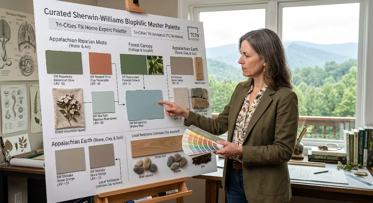
Sherwin-Williams offers a wide catalog of nature-inspired paints. Below is a curated selection of eleven outstanding biophilic colors tested specifically for East Tennessee daylight conditions.
+-------------------------------------------------------------------------+
|                  CURATED BIOPHILIC COLOR SPECTRUM                       |
|                                                                         |
|  BOTANICAL CANOPY       RIPARIAN ATMOSPHERE     EARTH & MINERAL         |
|  * Evergreen Fog        * Sea Salt              * Urbane Bronze         |
|  * Rosemary             * Rainwashed            * Redend Point          |
|  * Pewter Green         * Misty                 * Shiitake              |
|                                                                         |
|                    DIFFUSE WARM BIOPHILIC WHITES                        |
|                    * Alabaster    * Greek Villa                         |
+-------------------------------------------------------------------------+
Botanical Canopy and Foliage
These green biophilic colors draw their hues directly from native Appalachian trees, mountain laurel, and forest ferns.
Evergreen Fog (SW 9130)
- LRV: 30
- Color Family: Muted green-gray
- Pigment Balance: Soft botanical green with a gray and umber base
Evergreen Fog is one of the most versatile biophilic colors available. Its balanced gray-green character mirrors the evergreen rhododendron leaves that line our mountain streams. In East Tennessee homes, it acts as a visual bridge between interior rooms and the wooded landscape outside.
Because it has an LRV of 30, it absorbs harsh afternoon glare in west-facing living rooms while maintaining enough color depth to feel cozy in east-facing dining areas. It pairs naturally with warm wood trim and exposed stone fireplaces.
Rosemary (SW 6187)
- LRV: 14
- Color Family: Deep olive-forest green
- Pigment Balance: Rich botanical green supported by heavy gray and dark soil tones
Rosemary is an organic, deep green that echoes the shadowed forest floor of the Unaka Range. It is a bold choice among biophilic colors, designed for rooms with strong natural light or spaces meant for quiet retreat.
In south-facing studies, dens, or home libraries, Rosemary absorbs intense sunlight and prevents glare on reading surfaces and computer screens. When paired with natural leather, iron accents, and warm white oak, it creates a grounded, protective room that feels like a mountain lodge.
Pewter Green (SW 6208)
- LRV: 12
- Color Family: Deep mineral sage
- Pigment Balance: Dark forest green combined with cool slate-gray undertones
Pewter Green captures the darker tones of wet mountain moss growing on granite outcrops. Unlike warm olive tones, Pewter Green leans slightly cool, making it ideal for balancing hot southern light.
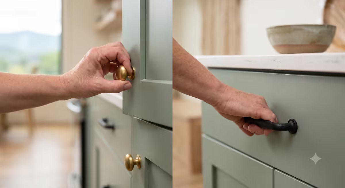
It is an exceptional option for kitchen cabinetry, accent walls, and primary bedrooms. When used alongside light stone countertops and natural wood floors, Pewter Green delivers dramatic biophilic colors that anchor high-ceiling great rooms.
Riparian and Highland Atmospheric Tones
These water- and sky-inspired biophilic colors capture the cool mist, flowing rivers, and mountain skies of our region.
Sea Salt (SW 6204)
- LRV: 63
- Color Family: Soft muted green-blue-gray
- Pigment Balance: Equal parts pale green, gentle blue, and
neutral gray
Sea Salt is a chameleon color that changes character throughout the day. In morning light, it reveals soft blue tones reminiscent of the Watauga River. As the afternoon sun warms the space, its soft sage-green undertones emerge.
With an LRV of 63, Sea Salt is light enough to brighten dim north-facing bathrooms, laundry rooms, and guest bedrooms. It is one of the most reliable biophilic colors for homeowners who want subtle color without overwhelming smaller spaces.
Rainwashed (SW 6211)
- LRV: 59
- Color Family: Soft watery blue-green
- Pigment Balance: Clean slate-blue balanced with light sea-glass green
Rainwashed provides a slightly more saturated blue-green tone than Sea Salt. It reflects the clean, fresh atmosphere of the mountains right after a summer rainstorm.
This hue works well in east-facing bedrooms, where early golden morning light brings out its green undertones, while afternoon shade highlights its soft, cooling blue side. It brings the relaxing energy of moving mountain water into everyday living areas.
Misty (SW 6232)
- LRV: 64
- Color Family: Atmospheric blue-gray
- Pigment Balance: Soft sky blue blended with cool limestone gray
Misty reproduces the exact color of low-hanging clouds over the Holston Valley on an overcast morning. It is a refined option among atmospheric biophilic colors, avoiding the icy, sterile look of standard light blues.
Misty performs well in rooms with small windows or low natural light. Its 64 LRV reflects soft light across the ceiling and walls, opening up tight spaces while keeping an organic connection to the Appalachian sky.
Appalachian Earth, Clay, and Stone
These grounded biophilic colors draw from the rich red clay soils, weathered bark, and ancient rock formations of East Tennessee.
Urbane Bronze (SW 7048)
- LRV: 8
- Color Family: Deep warm bronze-gray
- Pigment Balance: Dark charcoal infused with rich brown earth and warm olive
Urbane Bronze is a deep architectural neutral that feels like weathered tree bark and dark river stone. Because its LRV is only 8, it absorbs almost all incoming light.
It is ideal for accent walls behind natural stone fireplaces, media rooms, or exterior doors. In homes with large glass windows looking out over the mountains, painting window trim in Urbane Bronze frames the outdoor view, making the exterior landscape pop. It is one of the most sophisticated anchoring biophilic colors available.
Redend Point (SW 9081)
- LRV: 30
- Color Family: Warm terracotta-beige
- Pigment Balance: Soft earthen red blended with clay-beige and warm sand
Redend Point captures the warmth of exposed clay cutbanks along our country roads. It is a comforting, heart-warming shade that avoids the bright, aggressive look of standard terracotta.
In north-facing dining rooms and hallways that feel chilly under mountain shade, Redend Point injects natural warmth. It interacts beautifully with morning sunlight, creating an inviting space that feels like hand-thrown pottery.
Shiitake (SW 9173)
- LRV: 51
- Color Family: Warm stone greige
- Pigment Balance: Balanced neutral gray combined with warm mushroom-tan
Shiitake represents the middle ground between cool gray rock and warm dry soil. With an LRV of 51, it reflects half the light hitting it, making it an exceptional whole-house neutral.
Unlike basic beige, which can look yellow under artificial light, Shiitake stays true and balanced. It is one of the most dependable biophilic colors for open-concept floor plans, connecting kitchens, hallways, and living rooms seamlessly.
Diffuse Light Maximizers (Biophilic Warm Whites)
Biophilic design often calls for clean, reflective surfaces that maximize daylight without feeling cold or sterile.
Alabaster (SW 7008)
- LRV: 82
- Color Family: Warm organic white
- Pigment Balance: Pure white base with a drop of warm ochre and gray
Alabaster is an industry standard for good reason. It reflects 82% of incoming light while offering a gentle warmth that prevents rooms from feeling like hospitals.
In East Tennessee, where blue atmospheric haze can make stark white paints turn icy blue or cement-gray, Alabaster keeps its warm, welcoming glow. It is perfect for walls in shaded mountain homes or for interior trim and ceilings throughout any living space.
Greek Villa (SW 7551)
- LRV: 84
- Color Family: Soft sunny white
- Pigment Balance: Bright reflective white with a warm, subtle yellow-cream undertone
Greek Villa is slightly warmer and brighter than Alabaster. It is designed to capture and amplify weak morning or winter light.
In rooms with deep tree cover or small north-facing windows, Greek Villa brings a sunny, cheerful feel to the walls without looking yellow. It pairs cleanly with honey-toned hardwood floors, woven baskets, and linen fabrics, serving as a reliable foundation for layered biophilic colors.
Architectural Material Pairings in East Tennessee
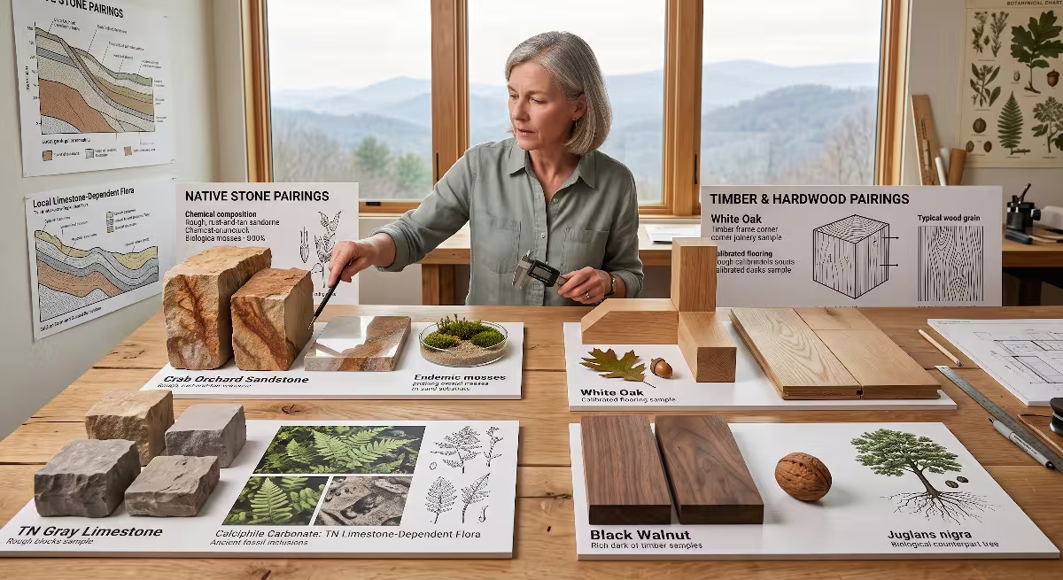
Biophilic interior design works best when your wall paint harmonizes with authentic, tactile building materials found across our region.
+-------------------------------------------------------------------------+
|                  REGIONAL MATERIAL INTEGRATION MATRIX                   |
|                                                                         |
|  NATIVE STONE                       HARDWOOD & TIMBER                   |
|  * Crab Orchard Sandstone           * White Oak Flooring                |
|    Pair with: Redend Point,           Pair with: Evergreen Fog,         |
|               Shiitake, Alabaster                Pewter Green, Alabaster|
|                                                                         |
|  * Tennessee Gray Limestone         * Black Walnut Accents              |
|    Pair with: Misty, Sea Salt,        Pair with: Rosemary,              |
|               Pewter Green                       Urbane Bronze          |
+-------------------------------------------------------------------------+
Native Stone Integrations
East Tennessee architecture frequently incorporates regional stone in fireplaces, foundation accents, and interior accent walls.
Crab Orchard Sandstone
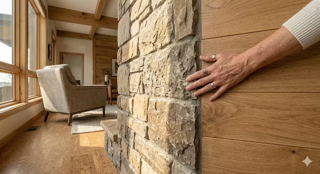
Mined along the Cumberland Plateau, this famous stone features warm streaks of tan, rust, gold, and pinkish-brown.
- Best Paint Pairings: Pair Crab Orchard stone with warm biophilic colors like Shiitake (SW 9173), Redend Point (SW 9081), and Alabaster (SW 7008).
- Design Rule: Avoid pairing Crab Orchard sandstone with cool blue-grays, which make the stone look overly orange by harsh visual contrast.
Tennessee Gray Limestone
Found throughout our river valleys and rolling hills, this dense stone has cool gray and charcoal tones with subtle white quartz veining.
- Best Paint Pairings: Complement gray limestone with nature-inspired biophilic colors like Pewter Green (SW 6208), Sea Salt (SW 6204), and Misty (SW 6232).
- Design Rule: The cool undertones of the limestone balance the gentle green-gray in the paint, creating an organic stone-and-water aesthetic.
Timber Framing and Regional Hardwoods
Wood provides immediate biophilic warmth. Matching wood species to your wall colors ensures a cohesive, high-end finish.
Native White Oak
White oak is the premier choice for flooring, cabinetry, and open shelving across modern mountain homes. Its pale golden-brown grain offers a clean, organic look.
- Best Paint Pairings: White oak pairs effortlessly with Evergreen Fog (SW 9130) and Alabaster (SW 7008). The soft green in the paint highlights the golden grain of the oak without fighting it.
Black Walnut and Dark Stained Woods
Rich, dark walnut brings deep earthiness to islands, fireplace mantels, and exposed beams.
- Best Paint Pairings: Frame dark timber with Rosemary (SW 6187) or Greek Villa (SW 7551). The contrast between deep botanical greens and rich walnut timber creates a cozy, secure woodland atmosphere.
Circadian Artificial Lighting Integration
Natural sunlight is only half the equation. When the sun goes down behind the mountains, your interior artificial lighting takes over. How your paint looks at night depends entirely on your light bulbs.
Artificial Lighting vs. Paint Pigment Reaction
Paint pigments react differently depending on the color temperature, measured in Kelvin (K), of your light bulbs:
2700K -------------------------- 3000K -------------------------- 5000K
[Warm Incandescent Glow]      [Crisp Clean Warm]             [Harsh Blue-White]
Enhances Earth Tones          Ideal for Biophilic Colors     Flattens Natural Pigments
(Redend Point, Shiitake)      (Evergreen Fog, Sea Salt)      (Causes Metameric Failure)
- 2700K (Warm White): Emits a heavy golden-amber light. This enhances warm biophilic colors like Redend Point and Shiitake, but it can make cool tones like Misty look muddy or greenish-yellow.
- 3000K (Soft / Clean White): The ideal color temperature for viewing biophilic colors. It delivers a balanced spectrum that renders greens, blues, and warm earth tones cleanly and accurately without turning yellow.
- 4000K to 5000K (Cool Daylight): Emits a harsh, blue-tinted light that feels like an office building. This light flattens the subtle undertones of biophilic colors, making your home feel cold and uninviting at night.
Always specify LED bulbs with a Color Rendering Index (CRI) of 90 or higher. High-CRI bulbs emit a full spectrum of light wavelengths, allowing the complex multi-pigment formulas in biophilic colors to show their full depth after dark.
Layered Lighting Placement for Biophilic Depth
In nature, light never comes from a single harsh point source on the ceiling. Light filters down through trees, bounces off the ground, and radiates from the horizon.
To showcase biophilic colors effectively:
- Avoid Central Overhead Glare: Relying solely on a center ceiling fixture creates harsh downward shadows and washes out wall paint.
- Use Wall Sconces: Fixtures that cast light up and down wall surfaces highlight the soft, matte texture of biophilic colors.
- Incorporate Low-Level Table Lamps: Placing warm 2700K to 3000K lamps on side tables and bookshelves casts warm pools of light across lower wall planes, mimicking the low angle of sunset and preparing your body for restful sleep.
Room-by-Room Specification Blueprint
Every room in your home serves a different biological and daily purpose. Here is how to specify biophilic colors room by room for maximum impact.
+-------------------------------------------------------------------------+
|                  WHOLE-HOME BIOPHILIC ROOM BLUEPRINT                    |
|                                                                         |
|  FOYER & GREAT ROOM        PRIMARY BEDROOM           HOME WORKSPACE     |
|  * Shiitake (Walls)        * Sea Salt (Walls)        * Evergreen Fog    |
|  * Greek Villa (Ceilings)  * Alabaster (Trim/Ceiling)* Alabaster (Trim) |
|  * Urbane Bronze (Accents) * Urbane Bronze (Doors)   * Natural Wood     |
|                                                                         |
|  Goal: Grand Transition    Goal: Rest & Recovery     Goal: Sustained    |
|        & Natural Light           via Lower Heart           Focus Without|
|        Dispersion                Rate Support              Visual Strain|
+-------------------------------------------------------------------------+
The Mountain Foyer and Great Room
- Primary Objective: Establish an immediate connection to the surrounding mountain landscape while managing bright, multi-directional light.
- Wall Color: Shiitake (SW 9173) or Evergreen Fog (SW 9130)
- Ceiling & Trim: Greek Villa (SW 7551) in Flat finish (ceiling) and Satin finish (trim)
- Accent Elements: Urbane Bronze (SW 7048) on window sashes and interior doors
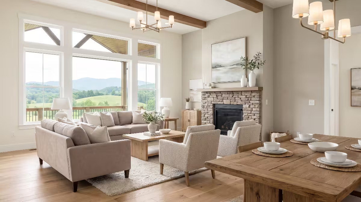
Great rooms in East Tennessee often feature cathedral ceilings and large window walls framing mountain views. Using mid-tone biophilic colors on the main walls softens the intense contrast between the bright outdoor sky and the interior space. This prevents eye strain while making the great room feel grounded and connected to the ridge lines outside.
Restorative Bedroom Suites
- Primary Objective: Promote deep physical relaxation, lower heart rates, and support the body’s natural sleep cycle.
- Wall Color: Sea Salt (SW 6204) or Rainwashed (SW 6211)
- Ceiling & Trim: Alabaster (SW 7008)
- Accent Elements: Rosemary (SW 6187) behind the headboard wall
Bedrooms require calming biophilic colors that help you unwind. Soft blue-greens like Sea Salt and Rainwashed reduce visual stimulation at the end of the day. When paired with breathable linen bedding, wool rugs, and warm side lighting, these colors transform a standard bedroom into a peaceful mountain sanctuary.
Biophilic Home Workspaces
- Primary Objective: Maintain mental alertness, reduce cognitive fatigue, and eliminate glare behind computer screens.
- Wall Color: Evergreen Fog (SW 9130) or Pewter Green (SW 6208)
- Ceiling & Trim: Alabaster (SW 7008)
- Accent Elements: Natural white oak desk and live indoor plants
Staring at bright monitors all day causes eye fatigue. Surrounding your workstation with botanical biophilic colors provides a calming visual resting point when you look away from your screen. Mid-tone green-grays absorb screen glare and promote calm, sustained focus throughout long working hours.
In-Situ Sampling and Testing Protocol in Ridge and Valley Topography
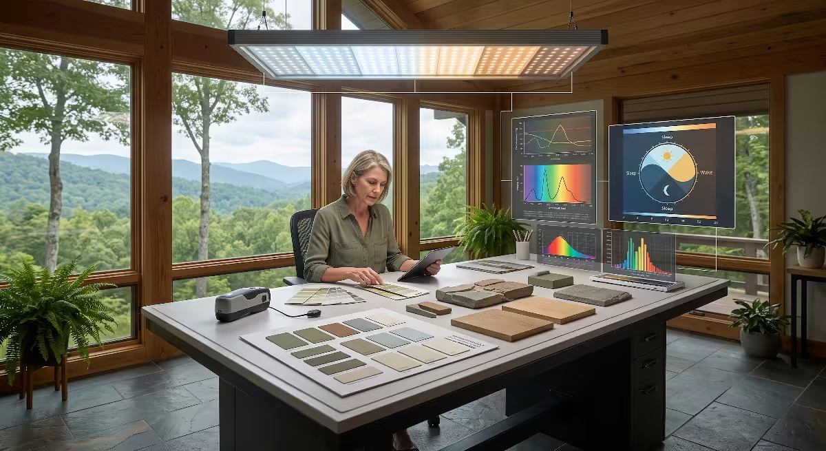
Never choose a paint color based solely on a two-inch paper paint chip under store fluorescent lighting. You must test biophilic colors inside your actual home under local mountain daylight.
The Large-Format Swatch Method
Small paint chips do not give your eye enough surface area to register how a color interacts with room shadows and surrounding trees.
+-------------------------------------------------------------------------+
|                  72-HOUR IN-SITU SAMPLING PROTOCOL                      |
|                                                                         |
|  Step 1: Paint two coats on 12x12 white poster boards or sample boards. |
|  Step 2: Leave a 1-inch white border around the edge of the board.      |
|  Step 3: Move boards to North, East, South, and West walls.             |
|  Step 4: Evaluate over 72 hours under 3 regional weather conditions:    |
|          * Morning Appalachian Mist / Fog                               |
|          * Direct Midday Mountain Sunlight                              |
|          * Full Overcast / Rainy Sky                                    |
+-------------------------------------------------------------------------+
- Get Large Sample Boards: Purchase 12-inch by 12-inch peel-and-stick sample sheets or paint two coats of actual sample paint onto white foam core boards.
- Leave a White Border: When painting sample boards, leave a one-inch white border around the edge. This prevents your current wall color from tricking your brain into misreading the new undertone.
- Move Samples Across All Four Walls: Mount the sample on the north, south, east, and west walls of the room.
- Observe Across 72 Hours: Check the samples at 8:00 AM, 12:00 PM, 4:00 PM, and 8:00 PM under three distinct mountain weather conditions:
- A foggy, overcast mountain morning
- A clear, sunny midday
- Evening artificial lighting with lamps turned on
Accounting for Exterior Glare and Reflection
Outside architectural features can strongly alter how biophilic colors appear on interior walls:
- Large Cedar or Pressure-Treated Decks: Sun bouncing off an outdoor wood deck casts a bright orange or yellow light onto adjacent living room ceilings. Using cooler biophilic colors like Evergreen Fog or Sea Salt counteracts this hot reflection.
- Metal Roofs: Unpainted galvanized or silver metal roofs reflect intense white glare into upper-story bedroom windows. In these rooms, avoid high-LRV whites and choose soft, light-absorbing shades like Misty or Shiitake.
- Nearby Water Bodies: If your home sits on Boone Lake, South Holston Lake, or near the Nolichucky River, moving water bounces shimmering, dynamic blue light into your home. Biophilic colors with soft blue and slate-gray undertones harmonize naturally with this water reflection.
Frequently Asked Questions about Biophilic Colors
What are the most popular Sherwin-Williams biophilic paint colors?
The most popular Sherwin-Williams biophilic colors include Evergreen Fog (SW 9130), Sea Salt (SW 6204), Urbane Bronze (SW 7048), Rosemary (SW 6187), and Alabaster (SW 7008). These colors are widely specified because they use multi-pigment formulas based on natural foliage, river water, weathered stone, and warm daylight.
How does East Tennessee mountain light affect paint colors?
East Tennessee light is shaped by mountain elevation, dense forest canopies, and natural atmospheric haze. The haze scatters blue light wavelengths, which can make flat gray paints look cold and dreary. In the summer, light filtering through tree canopies adds a heavy yellow-green cast. Choosing biophilic colors with warm mineral, clay, or balanced slate undertones prevents walls from looking washed out or sickly.
What LRV is best for a room with heavy tree cover in East TN?
For rooms heavily shaded by mature hardwood trees, choose biophilic colors with a Light Reflectance Value (LRV) between 60 and 75. Shades like Sea Salt (LRV 63), Misty (LRV 64), and Alabaster (LRV 82) reflect available light efficiently around the room without turning dull in the shadows.
Is Evergreen Fog too dark for a living room with morning light?
No. Evergreen Fog (SW 9130) has an LRV of 30, placing it in the balanced mid-tone range. In east-facing living rooms, the bright golden morning sun brings out its warm sage-green notes. When the light softens in the afternoon, its slate-gray base provides a cozy, grounded feel that does not feel cave-like, especially when paired with warm white trim.
What Sherwin-Williams white works best with natural wood trim and stone in TN?
Alabaster (SW 7008) and Greek Villa (SW 7551) are the top choices. Alabaster (LRV 82) contains subtle beige and gray undertones that pair naturally with white oak, black walnut, and gray limestone. Greek Villa (LRV 84) offers a slightly warmer cream base that matches beautifully with Crab Orchard sandstone and warm pine timber.
Regional Specification Master Table and Resource Guide
Use this master reference table when ordering paint, specifying sheens, and coordinating finishes for your East Tennessee project.
| Color Name & Code | LRV | Color Character | Best Regional Application | Ideal Sheen Level | Complementary Trim Color |
| Evergreen Fog (SW 9130) | 30 | Botanical Sage-Gray | Great Rooms, Offices, Exterior Doors | Cashmere Flat / Matte | Alabaster (SW 7008) |
| Rosemary (SW 6187) | 14 | Deep Forest Olive | Studies, Dens, Accent Walls | Emerald Matte | Greek Villa (SW 7551) |
| Pewter Green (SW 6208) | 12 | Mineral Slate Green | Kitchen Cabinets, Primary Suites | Emerald Satin / Matte | Alabaster (SW 7008) |
| Sea Salt (SW 6204) | 63 | Misty Aqua-Gray | Bathrooms, Laundry, Shaded Bedrooms | Duration Satin / Matte | Pure White (SW 7005) |
| Rainwashed (SW 6211) | 59 | Clear Water Blue-Green | East-Facing Bedrooms, Sunrooms | Cashmere Low Lustre | Alabaster (SW 7008) |
| Misty (SW 6232) | 64 | Highland Cloud Blue | Narrow Hallways, Dim Living Areas | SuperPaint Velvet | Greek Villa (SW 7551) |
| Urbane Bronze (SW 7048) | 8 | Weathered Bark Bronze | Fireplace Surrounds, Window Trim | Emerald Urethane Satin | Alabaster (SW 7008) |
| Redend Point (SW 9081) | 30 | Appalachian Clay | North-Facing Dining Rooms, Entries | Cashmere Flat Enamel | Greek Villa (SW 7551) |
| Shiitake (SW 9173) | 51 | Mushroom Greige | Open Floor Plans, Hallways, Basements | Duration Matte | Alabaster (SW 7008) |
| Alabaster (SW 7008) | 82 | Warm Organic White | Whole-House Trim, Ceilings, Shaded Walls | Duration Matte / Satin | Self-Trim (Semi-Gloss) |
| Greek Villa (SW 7551) | 84 | Sunny Mineral White | Low-Light Kitchens, Shaded Living Rooms | Cashmere Flat Enamel | Alabaster (SW 7008) |
Best Practices for Sheen Selection in Mountain Environments
- Ceilings: Always specify Flat sheen. Flat finishes absorb ceiling glare and hide drywall joints, allowing biophilic colors to cast an even, unbroken surface overhead.
- Living Areas & Bedrooms: Choose Matte or Flat Enamel (such as Sherwin-Williams Cashmere Flat Enamel or Emerald Matte). These premium low-sheen finishes provide rich color saturation and wipeable durability without shiny reflections that disrupt the organic look of biophilic colors.
- Kitchens & Bathrooms: Use Satin or Low Lustre sheens. These finishes resist moisture and steam in high-humidity areas while retaining the soft texture of your chosen wall color.
- Trim, Doors & Millwork: Specify Satin or Semi-Gloss (such as Emerald Urethane Trim Enamel). This gives baseboards, doors, and window casings a smooth, durable finish that stands out subtly against matte biophilic colors on adjacent walls.
Bringing the natural beauty of the Appalachian landscape into your home is a rewarding journey. By taking into account regional light physics, selecting authentic mineral pigments, and carefully testing samples in your unique home setting, you can create a healthy, restorative living space that celebrates the best of East Tennessee.