

Neutral Fall Color Palettes
For nearly a decade, residential construction was dominated by cold, sterile gray paint and stark white trim. Walk into almost any subdivision built between 2014 and 2020, and you will see the exact same look: cool gray walls, icy marble, and chrome fixtures. That trend had its day, but it left many homeowners feeling like they were living inside an operating room.
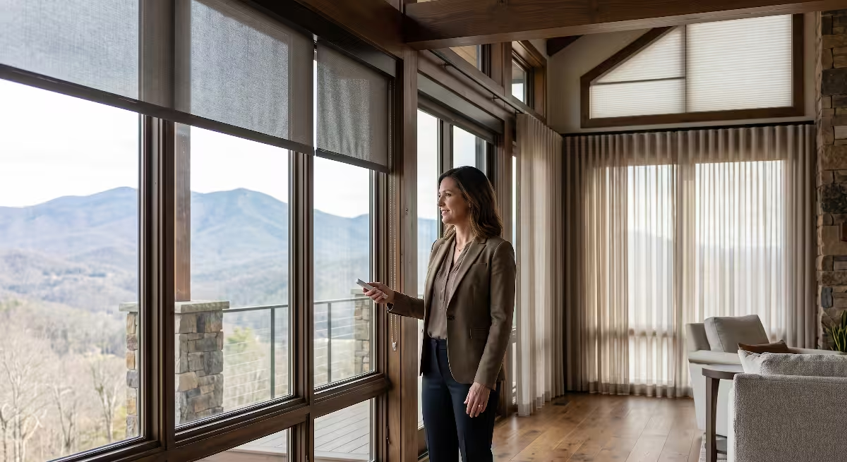
When you build a custom home in the rolling hills of East Tennessee, you quickly realize that sterile grays do not work with our landscape. Outside your windows, you see the ridges of the Appalachian Mountains, dense oak forests, and rich red clay soils. A cold home interior creates an uncomfortable visual shock when set against that natural backdrop.
Homeowners want warmth, comfort, and authenticity. They want a home that feels like a sanctuary when the autumn air turns brisk in October. The challenge is that many people confuse warmth with dark, heavy clutter. You do not need to stain your walls dark brown or buy orange novelty decor to feel cozy.
Instead, a well-planned neutral fall color palette provides the ideal foundation. It honors the clean lines of modern architecture while welcoming the natural warmth of the harvest season. A proper neutral fall color palette creates a space that feels calm, bright, and grounded. It solves the cold farmhouse dilemma once and for all.
The Female Custom Home Buyer Perspective
Many women are designing how everyday life will feel for their families. They think about the morning rush in the kitchen, hosting family gatherings at Thanksgiving, and having a quiet space to decompress after a long workday.
A sterile, high-contrast interior does not support peaceful living. It shows every smudge, scuff, and dog hair. It feels demanding rather than restful. Female custom home buyers often tell me they want a home that feels welcoming without being high maintenance. They want materials that age with grace.
This is where a balanced neutral fall color palette proves its worth. By moving away from stark white and leaning into warm parchment, soft linen, and muted stone, the home becomes forgiving and calming. It creates an environment that supports real daily routines.
A thoughtful neutral fall color palette also respects your budget. When your core interior colors are grounded in warm neutrals, you do not have to repackage your entire house every time the seasons change. The foundation works quietly in the background, supporting your life without demanding constant cosmetic updates.
The Structural Premise
Color never lives in a vacuum. Paint interacts directly with daylighting, window placement, framing lumber, ceiling heights, and millwork profiles.
If you pick a paint color at a home improvement store under fluorescent lights, you will almost certainly be surprised when it goes up on your sheetrock. Paint reflects the materials around it. A room with heavy white oak ceiling beams will pull different tones from a wall than a room with painted pine beadboard.
When we design a modern farmhouse, we use substantial architectural elements. We install rough-sawn mantels, thick window casings, tongue-and-groove ceilings, and shiplap accents. These wood elements are warm by nature. If you slap an icy gray paint next to a natural white oak post, the two materials will fight each other. The wood will look overly yellow, and the paint will look like wet cement.
A cohesive neutral fall color palette bridges this gap. It works in harmony with wood framing, masonry fireplaces, and metal hardware. By treating your color selection as an engineering choice rather than an afterthought, you ensure that every material in the home supports the next.
A well-executed neutral fall color palette ties your drywall, cabinetry, and structural timbers into one seamless living space.
The Engineering of Neutral Warmth: Undertones and Light Reflectance Values
Understanding Light Reflectance Value
Light Reflectance Value, or LRV, is a measurement used by architects, builders, and paint manufacturers. It measures the percentage of light that a paint color reflects when illuminated by a light source. The scale runs from zero to one hundred. An LRV of zero represents absolute black, which absorbs all light. An LRV of one hundred represents pure white, which reflects all light.
In home building, understanding LRV is essential for energy efficiency and visual comfort. If you paint a room with an LRV that is too low, the room will swallow natural light. You will find yourself turning on overhead lamps in the middle of the day. If you choose an LRV that is too high, the room will cause visual glare, especially in rooms with large south-facing windows.
For a modern farmhouse, the target range for primary wall surfaces sits between 70 and 82 LRV. This range provides enough reflection to keep open-concept rooms bright, but enough pigment to prevent the sterile look of pure white.
When you build a neutral fall color palette, you want your base wall colors in this exact 70 to 82 LRV pocket. A paint with an LRV of 75 feels like soft cream in the morning and transitions into a cozy, glowing oat tone as the sun sets behind the mountains.
Selecting the right LRV ensures that your neutral fall color palette stays balanced during short autumn days when natural sunlight is at a premium.
Analyzing Undertone Chemistry
Every neutral paint color has an underlying base formula that creates its undertone. In modern farmhouse design, undertones make or break an interior. The three most common undertone families for neutrals are yellow-cream, pink-taupe, and green-gray.
Yellow-cream undertones add immediate warmth. However, if the manufacturer adds too much yellow pigment, the wall can look like old butter or dated yellow wallpaper from the 1980s. Pink-taupe undertones can look sophisticated on a small swatch, but across a twenty-foot great room wall, they can turn uncomfortably fleshy. Green-gray undertones, often called greige, offer the cleanest, most modern transition from the old gray trend into warm design.
You must also consider how low-E window glass affects undertone chemistry. Modern building codes require double-pane windows with low-emissivity coatings to block solar heat gain. These coatings have a faint green or bronze tint. When outdoor sunlight passes through your windows, that coating filters the light.
If your wall paint has a heavy yellow undertone, and the window glass adds a slight green filter, your walls can end up looking slightly sickly. This is why testing your neutral fall color palette in the actual framed home is critical. A balanced neutral fall color palette uses paints with earthy, mineral undertones that resist shifting under treated glass.
Sheen Selection for Real-World Durability
Paint sheen is not just an aesthetic choice. It is a mechanical surface specification that dictates how light bounces and how easy the wall is to clean. The primary sheen levels used in residential construction are flat, matte, eggshell, satin, semi-gloss, and high-gloss.
For modern farmhouse walls, I advise clients to use a high-grade scrubbable matte or a low-sheen eggshell. Flat paints absorb light beautifully and hide small drywall imperfections, but standard flat paint shows fingerprints immediately. Modern scrubbable matte formulas give you the light-diffusing beauty of flat paint with the resin strength needed to wipe away dirt.
Eggshell provides a soft glow, making it a reliable choice for hallways and children’s rooms. When working within a neutral fall color palette, an eggshell sheen brings out the subtle warmth in taupe and linen tones without creating harsh reflections.
Trim, doors, and baseboards require a satin or semi-gloss finish. The extra resin in these finishes creates a hard, durable shell that stands up to vacuum cleaner bumps, pets, and muddy boots. For a balanced neutral fall color palette, painting your trim in a satin finish with a slightly lighter, warm white creates clean definition against matte walls.
The Autumn Farmhouse Palette: From Foundation to Accent
The Anchor Neutrals: Sixty Percent of the Room
When planning room colors, builders and designers often use the 60-30-10 rule. Sixty percent of the room is your foundation color, thirty percent is your secondary material or color, and ten percent is your accent.
Your anchor neutral covers roughly sixty percent of the visual space. This includes your primary drywall expanses, large area rugs, and major upholstered pieces like sectional sofas. In a modern farmhouse, this anchor should never be stark white. Instead, look for shades inspired by parchment, unbleached cotton, and light oatmeal.
These soft foundation tones establish the warmth of your neutral fall color palette. They soften the transition between open living areas and private hallways. When you walk from a bright kitchen into a cozy living room, a parchment anchor neutral keeps the eye relaxed.
Using a warm off-white or light greige as your sixty percent base also ensures that your neutral fall color palette remains usable year-round. It feels cozy when October arrives, but it still feels crisp and clean when spring returns.
The Architectural Wood Tones: Thirty Percent of the Room
The thirty percent layer belongs to your architectural wood elements and secondary finishes. In modern farmhouse construction, wood is not just furniture; it is part of the building’s skeleton.
Rift-sawn white oak is the gold standard for modern farmhouse millwork and flooring. Rift-sawn boards are cut at an angle that produces a straight, tight grain pattern without the wild cathedrals found in plain-sawn lumber. This straight grain gives a clean, modern look.
To keep the wood looking natural, specify a clear, non-yellowing water-based polyurethane or a natural hardwax oil. Avoid traditional oil-based polyurethanes, which turn an artificial amber color over time.
Alongside white oak, you can weave in deeper architectural timbers such as aged walnut or reclaimed chestnut for fireplace mantels and open shelving. These rich wood tones act as a natural mid-tone within your neutral fall color palette.
Wood provides organic texture that paint simply cannot replicate. When combined with stone fireplaces and cabinetry, natural wood anchors the secondary layer of your neutral fall color palette with strength and permanence.
The Muted Autumn Accents: Ten Percent of the Room
The final ten percent of your room design is where you introduce seasonal accent colors. Many people make the mistake of using loud, saturated tones here, such as bright orange or dark purple. In a modern farmhouse, high-saturation colors clash with the calm architecture.
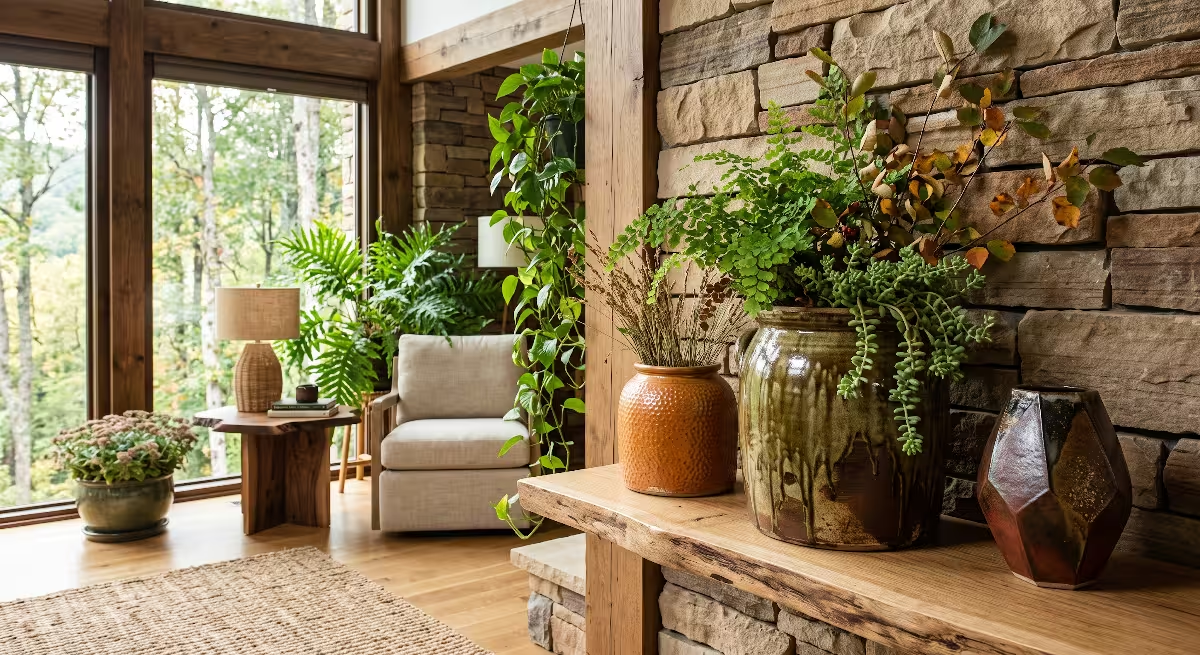
Instead, pull your accent colors directly from the autumn landscape outside your door. Think of sun-baked terracotta, raw umber, dried sagebrush, and muted mustard seed. These colors are desaturated, meaning they have a touch of brown, gray, or black mixed into their base formula.
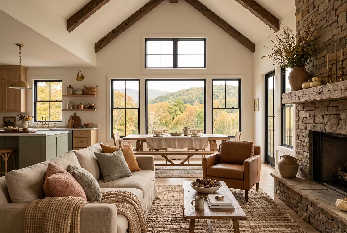
You can introduce these accents through throw blankets, linen pillows, glazed ceramic vases, and leather accent chairs. A cognac leather armchair acts as a stunning fall accent while remaining a classic neutral piece for years to come.
By keeping your accents grounded in nature, your neutral fall color palette feels intentional, calm, and deeply connected to the natural world.
Architectural Palette Matrix
| Color Role | Recommended Shade Family | LRV Target | Undertone Profile | Architectural Application |
| Foundation Wall | Creamy Alabaster / Parchment | 74 to 78 | Soft yellow and warm beige | Great room drywall, hallway expanses |
| Secondary Neutral | Warm Greige / Pale Oat | 60 to 68 | Warm stone and subtle taupe | Built-in shelving backs, secondary bedrooms |
| Grounded Accent | Muted Olive / Dried Sage | 22 to 32 | Yellow-green and moss | Mudroom cabinetry, scullery millwork |
| Earthy Accent | Sun-Baked Terracotta | 24 to 30 | Burnt red-orange clay | Hearth accents, glazed pottery, textile pillows |
| Hardware and Trim | Aged Bronze / Matte Black | Less than 10 | Neutral deep iron | Window sashes, door levers, light fixtures |
Room-by-Room Execution: Blending Millwork, Lighting, and Textiles

The Great Room and Hearth
The great room is the center of the modern farmhouse. It is where your family gathers, where guests congregate, and where your architectural choices are on full display. The focal point of this space is almost always the fireplace hearth.
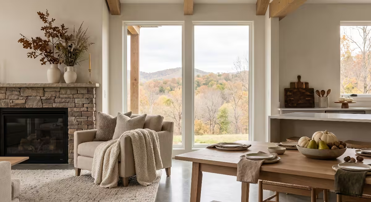
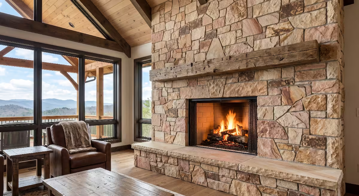
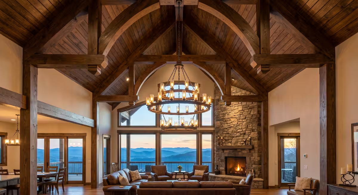
To build a rich neutral fall color palette in the great room, start with the masonry. If you are using stone, select local fieldstone or lime-washed brick that contains warm tan, cream, and faint iron-rust veins. Top the firebox with a heavy rough-sawn white oak timber mantel. The raw texture of the wood immediately sets a warm tone.
Paint the surrounding great room walls in your anchor neutral, such as a soft alabaster with an LRV around 76. For furniture, select slipcovered sofas in an oatmeal performance linen. Layer the seating with chunky wool waffle-knit blankets and washed terracotta pillows.
Pay close attention to your artificial lighting. Modern farmhouse vaulted ceilings often feature recessed LED can lights. Ensure your builder installs LED bulbs rated between 2700K and 3000K color temperature. Cool 4000K or 5000K bulbs will wash out your warm finishes and ruin the cozy feeling of your neutral fall color palette. Warm 2700K light brings out the golden tones in your timber and makes your fall accents glow.
The Kitchen and Butler’s Pantry
Kitchens in custom farmhouses are hard-working spaces that require careful balance between sanitary cleanliness and visual warmth. A solid white kitchen can feel sterile, but an entirely dark kitchen can feel cave-like.
A great way to use a neutral fall color palette in the kitchen is through a two-tone cabinetry plan. Paint the perimeter cabinets in a creamy warm off-white, matching or slightly lighter than your wall color. For the central island, use a contrasting finish, such as natural rift-sawn white oak or a muted taupe-gray paint.
For countertops, look at honed soapstone or quartz slabs that feature warm, subtle gold veining instead of sharp gray veins. Honed finishes have a soft, matte feel that matches farmhouse textures much better than high-gloss polished surfaces.
Add warmth through your plumbing and cabinet hardware. Skip polished chrome. Choose unlacquered brass, antique copper, or oil-rubbed bronze. Unlacquered brass develops a natural patina over time as your family touches it, adding authentic character.
In the butler’s pantry or scullery, you can take a bolder step with your neutral fall color palette. Painting the pantry cabinets in a rich, muted olive green creates a cozy, historic feel that makes food storage feel like an old-world larder.
The Dining Room and Gathering Nooks
The dining room is where hospitality happens. Whether you are hosting a formal Thanksgiving dinner or eating weeknight chili, the room should invite people to sit down and linger.
Start with the dining table. A solid white oak or reclaimed chestnut trestle table provides an immediate connection to classic carpentry. Treat the tabletop with a matte hardwax oil to highlight the natural grain patterns while protecting the wood from water spots and heat rings.
Surround the table with chairs that mix materials. Pairing wooden armchairs with slipcovered linen side chairs softens the acoustics of the room. Large open dining spaces can be noisy; fabric upholstery and woven rugs help absorb sound.
Set the table using elements of your neutral fall color palette. Woven seagrass placemats, washed clay-colored linen napkins, and speckled stoneware plates bring tactile warmth to the table. For a centerpiece, avoid artificial plastic floral arrangements. Instead, use a heavy stone bowl filled with real heirloom squash, or a simple earthenware crock holding dried sorghum, wheat, or cut oak branches from your yard.
This simple approach keeps your neutral fall color palette grounded in honest, natural materials.
The Primary Suite and Private Sanctuary
The primary bedroom should be the quietest, most peaceful room in the home. In custom construction, this room is designed as a sanctuary where homeowners can disconnect from daily stress.
To add architectural interest and acoustic comfort, consider a wood ceiling detail. Installing tongue-and-groove white oak paneling or box beams overhead lowers the visual volume of a high ceiling and creates an immediate sense of shelter. Paint the bedroom walls in a warm greige with a slightly lower LRV, around 68, to create an intimate, cocoon-like feel.
Bedding is your primary tool for layering a neutral fall color palette in the bedroom. Start with crisp, breathable ivory linen sheets. Add a washed caramel, fawn, or dusty plum linen duvet cover at the foot of the bed. Finish the look with a heavy alpaca or lambswool throw blanket.
Keep your window treatments simple and functional. Hang floor-to-ceiling drapery panels made from heavy unlined linen in an oatmeal shade. Linen lets soft morning light filter into the room while providing evening privacy.
Using natural fiber textiles inside your neutral fall color palette creates a restful bedroom that feels warm in the fall and breezy in the summer.
The Entryway, Foyer, and Mudroom
The entryway sets the tone for your entire home. In our region, autumn weather brings rain, falling leaves, and red clay mud. The foyer and mudroom must look beautiful while standing up to heavy foot traffic.
Flooring in these transitional spaces needs to be durable. Instead of running hardwood straight to the exterior door, consider setting herringbone brick pavers or dark slate tiles in the entryway. Brick pavers bring wonderful red-orange and brown earth tones into your neutral fall color palette, and they handle wet boots with ease.
In the mudroom, install custom board-and-batten millwork with heavy-duty iron coat hooks. Paint the millwork in a durable satin finish using a muted earth tone, such as dried sage or warm stone gray. This protects the lower half of the wall from scuffs caused by backpacks and boots.
Add open cubbies with woven ash or split-oak baskets to store hats, gloves, and dog leashes. Place a sturdy white oak bench by the door so family members have a comfortable spot to take off their shoes.
By pairing durable masonry floors with warm painted wood, your mudroom introduces your neutral fall color palette the second someone steps across the threshold.
The Female Custom Home Buyer’s Practical Priorities for a Neutral Fall Color Palette
Rejecting Seasonal Plastic
Walk down the seasonal aisle of any big-box craft store in September, and you will see shelves overflowing with orange plastic pumpkins, fake glitter-covered leaves, and synthetic wreaths. Not only do these items look cheap, but they also take up valuable storage space in your attic or basement for ten months of the year.
A true modern farmhouse celebrates authenticity. When you design a custom home with a balanced neutral fall color palette, you do not need bright novelty decorations to signal that autumn has arrived. The house itself does the work through its materials, textures, and architectural finishes.
Celebrate the season with real items from the garden and forest. Pick up heirloom Cinderella pumpkins with their muted sage, white, and pale peach rinds. Place them on your front porch stairs or hearth. Cut a few bare branches with dried seed pods from the woodline and place them in a heavy stoneware jug on your kitchen island.
When Thanksgiving passes, these organic items can be composted. You do not have to pack away giant plastic bins. Embracing real materials keeps your home clutter-free and allows your neutral fall color palette to shine through natural simplicity.
High-Traffic Performance and Durability
A home is meant to be lived in, not treated like a museum. When women plan custom homes, they often ask about durability. They want to know if their light-colored sofa will survive muddy dog paws, or if their white kitchen cabinets will chip when their children bang pots against them.
Building a neutral fall color palette does not mean sacrificing durability. The secret lies in specifying commercial-grade performance fabrics and hard-wearing finishes.
When selecting fabric for sofas, dining chairs, and barstools, look for performance textiles like Crypton, Revolution, or Sunbrella indoor fabrics. These materials are engineered at the fiber level to resist liquids, stains, and odors. A light oatmeal or warm linen performance fabric can easily handle spilled red wine or coffee; the liquid beads up on the surface so you can blot it away with a clean towel.
For painted surfaces, insist on high-solids urethane trim enamels for your baseboards, doors, and cabinets. These paints cure into an exceptionally hard finish that resists chipping and can be washed with mild soap and water.
When your finishes are this tough, you can enjoy a bright, warm neutral fall color palette without worrying about everyday family messes.
Long-Term Versatility Across Seasons
One of the greatest benefits of an intentional neutral fall color palette is its year-round flexibility. A color scheme that only works for two months out of the year is an inefficient use of your construction and decorating budget.
Because this palette is built on warm mineral neutrals, natural timbers, and muted botanical accents, it transitions between seasons effortlessly. In October, your space feels like an autumn retreat because of your wool throws, amber glass, and terracotta pottery.
When December arrives, you do not need to repaint or swap out your furniture. Simply replace the terracotta accents and dried grasses with fresh cedar boughs, white pine garland, and simple cream wool stockings. The warm white walls and rich oak millwork form the perfect backdrop for traditional holiday greenery.
When spring arrives in March, pack away the heavy wool blankets. Introduce crisp white linen throws, fresh green botanical stems, and light woven cotton rugs. Your neutral fall color palette continues to serve as a calm, bright foundation through every month of the year.
Common Questions About Neutral Fall Palettes in Farmhouse Homes
What Are the Best Warm Neutral Paint Colors for a Modern Farmhouse?
When selecting paint for custom homes, we rely on time-tested paint formulas that maintain their integrity under different lighting conditions. Four specific colors consistently perform well in modern farmhouse interiors:
- Sherwin-Williams Alabaster (SW 7008): This is one of the most reliable warm whites on the market. With an LRV of 82, it reflects ample light while maintaining a soft, creamy undertone that never turns yellow or cold. It works wonderfully for great room walls and ceilings.
- Benjamin Moore White Dove (OC-17): A designer favorite for decades, White Dove has an LRV of 83. It features a faint touch of gray in its base, which keeps it soft and prevents glare. It is an exceptional choice for trim, doors, and kitchen cabinets.
- Sherwin-Williams Shoji White (SW 7042): Shoji White sits at an LRV of 74, making it a true transitional greige. It bridges cream and light gray with a touch of warm beige. It is perfect for homeowners who want their walls to look cozier and slightly darker than standard white trim.
- Benjamin Moore Pale Oak (OC-20): With an LRV of 69, Pale Oak provides rich, elegant depth. It is an earthy, muted greige that looks like soft wool. It pairs beautifully with white oak floors and black iron light fixtures.
Using these dependable shades ensures that your neutral fall color palette has a strong, tested foundation.
Are Modern Farmhouse Colors Warm or Cool?
Modern farmhouse colors have shifted decisively toward warm tones. In the early days of the modern farmhouse trend, many builders used cool grays, bright white subway tile, and chrome fixtures. Over time, homeowners realized that cool grays felt too clinical, especially in large open-concept floor plans with high ceilings.
Today, the modern farmhouse style relies on warm neutrals. We use creamy whites, warm greiges, soft beiges, and natural earth tones. These warmer colors soften the clean, sharp lines of modern architecture.
Warm neutrals also provide a much better visual partner for natural stone fireplaces and timber framing. While black accents and bronze metals are still used to provide crisp contrast, the background envelope of the home is warm, welcoming, and relaxed. A well-designed neutral fall color palette captures this balance perfectly.
How Do You Bring Fall Colors into a Farmhouse Interior Without Using Bright Orange?
Bringing autumn warmth into your home does not require loud, saturated orange accents. High-saturation colors tend to overwhelm a room, fight against architectural wood details, and feel dated the moment the season passes.
Instead, introduce harvest tones through desaturated, nature-inspired colors and tactile materials:
- Terracotta and Clay: Use unglazed terracotta pots, brick pavers, and clay-colored linen pillows. These items provide earthy red-orange warmth without the bright look of artificial plastic.
- Cognac Leather: Incorporate natural caramel or cognac leather on barstools or accent chairs. Leather adds rich color, warmth, and a material that patinas beautifully over time.
- Spiced Amber and Honey: Use amber glassware, raw beeswax candles, and golden-toned wool blankets to bring in harvest light.
- Dried Botanicals: Fill vases with dried oats, wheat, seed pods, or ornamental grasses. Their natural straw tones add subtle fall texture.
Using these organic alternatives allows you to build a sophisticated neutral fall color palette that honors the season in a quiet, elevated way.
What Is the Difference Between Rustic Farmhouse and Modern Farmhouse Color Schemes?
While both styles celebrate rural living, their color schemes and material treatments are very different:
- Rustic Farmhouse: This style leans heavily on distressed, aged finishes. Color palettes often feature dark, heavy wood stains, antiqued cream paint with crackle finishes, and high-contrast historical colors like barn red, mustard yellow, and navy. Wood finishes often show heavy saw marks and dark distressing.
- Modern Farmhouse: This style is cleaner, simpler, and more architectural. The color palette relies on high-LRV warm neutrals, clean white millwork, and crisp black or aged bronze iron hardware. Wood finishes are typically kept light and natural, such as wire-brushed or rift-sawn white oak with clear matte sealers.
A modern farmhouse uses a tight, disciplined neutral fall color palette to create an uncluttered, peaceful environment that emphasizes open space, natural daylight, and clean structural lines.
The Builder’s Field Checklist: Testing Your Palette Before Construction
Step 1: On-Site Drywall Swatching
The single biggest mistake homeowners make is selecting paint colors from a tiny paper swatch inside a brightly lit paint store. Fluorescent store lighting looks nothing like natural residential daylight.
Once your custom home has drywall hung, taped, and primed, it is time to test your colors on site:
- Avoid Painting Directly on the Drywall: If you paint sample patches directly on the primed sheetrock, you will create slight texture differences that can flash through your final paint coat.
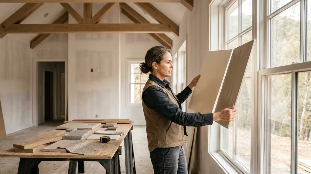
- Use Large Sample Boards: Purchase several 24-by-36-inch white foam-core boards or heavy watercolor paper. Paint each board with two full coats of your candidate colors, leaving a one-inch white border around the edge. That white border prevents the existing wall color from tricking your eyes.
- Move the Boards Around: Move the sample boards from room to room. Hang them in the great room, the primary bedroom, and the windowless hallway. Look at them next to your window casings and baseboards.
Testing your neutral fall color palette on large movable boards gives you an accurate preview of how the color behaves across the home.
Step 2: Timber and Countertop Collocation
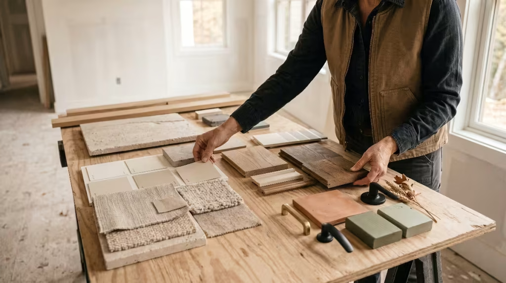
Color does not exist on its own; it reacts to every material placed next to it. In the construction industry, we use a process called collocation. This simply means gathering physical samples of all your materials and placing them side by side on a flat surface.
Before your builder orders your flooring, cabinets, and paint, collect your physical samples:
- A cut-off piece of your actual rift-sawn white oak flooring with its final protective topcoat applied.
- A sample cabinet door showing the exact paint or stain finish for your kitchen and bathrooms.
- A slab cut or remnant of your quartz or soapstone countertop.
- Your painted sample boards representing your neutral fall color palette.
- Samples of your plumbing and cabinet hardware in brass, bronze, or black.
Place all these materials together on a folding table on your job site under natural daylight. Look at how the undertones interact. Does the oak floor pull an unwanted pink tone out of your greige paint board? Does your countertop veining look green next to your cabinet door?
Catching these subtle color clashes on a job site table takes five minutes and saves thousands of dollars in repainting costs. Collocation ensures that your neutral fall color palette matches your wood, stone, and metal finishes before construction begins.
Step 3: The Dawn-to-Dusk Lighting Audit
The final step in your field checklist is a comprehensive lighting audit. Sunlight changes dramatically in angle and color temperature as it moves across the sky. A paint color that looks warm and inviting at sunrise can look completely different by late afternoon.
Plan a day to visit your construction site at three specific times:
- Early Morning (8:00 AM): Morning sunlight has a soft, cool, blue-tinted quality. Check your east-facing rooms to ensure your paint does not look chalky or washed out.
- Midday (1:00 PM): Midday sun shines directly overhead and brings intense, bright white light through south-facing windows. Make sure your paint does not cause blinding glare or reveal unwanted drywall seams.
- Late Afternoon and Dusk (6:00 PM): As the sun sets, daylight turns warm, golden, and amber. Check your west-facing rooms to confirm that your creamy neutrals do not turn overly orange or muddy.
- Nighttime Under Artificial Light: If your temporary construction lighting is wired, turn on your LED bulbs. Inspect the rooms under 2700K or 3000K lighting to confirm that your space feels warm and comfortable without outdoor sunlight.
Taking the time to complete this dawn-to-dusk audit guarantees that your neutral fall color palette performs reliably through every hour of the day.
Building a Home That Welcomes You Every Day
Building a custom modern farmhouse is an exciting journey. It is your opportunity to create a home that reflects how your family truly lives, works, and gathers. By moving away from sterile, cold grays and embracing the quiet beauty of warm neutrals, you give your home an enduring foundation.
A carefully chosen neutral fall color palette does not demand attention. It works quietly with the structure of your house, framing the changing trees outside your windows, complementing the grain of your white oak floors, and highlighting the craftsmanship of your trim carpentry.
When the autumn winds pick up and the mountain air turns cold, your home should be a place of warmth, comfort, and peace. With the right planning, proper understanding of undertones, and honest materials, your neutral fall color palette will welcome your family home for many seasons to come.