

East Tennessee possesses one of the most diverse and beautiful natural landscapes in North America. From the jagged ridgelines of the Unaka Mountains to the rolling pasture lands along the Holston and Watauga rivers, our local environment offers a rich display of color, texture, and light. When we build or paint a home in this region, our choices can either celebrate that natural beauty or interrupt it. Choosing exterior color palettes that blend homes into the surrounding hills and valleys is not just about curb appeal. It is about honoring the unique spirit of the land we call home.
This article covers how the built environment connects with nature as far as the exterior color palette. Biophilic design is the practice of connecting buildings and people to the natural world. In our corner of East Tennessee, that means looking at the native soils, ancient rock formations, forest canopies, and seasonal changes to find colors that feel authentic and grounded.
When you select exterior color palettes for your house, you make a permanent mark on your neighborhood and the broader landscape. A home that uses thoughtful exterior color palettes looks as though it grew naturally out of the hillside rather than being dropped there by accident. In this comprehensive guide, we will explore the science, the local ecology, and the practical steps you need to choose exterior color palettes that fit our region. Whether you live in Bristol, Kingsport, Johnson City, or out in rural Carter or Unicoi counties, these principles will help you create a home that sits in peaceful balance with the hills.
Fundamental Chromatics
The Problem with Stark Facades in East Tennessee
Over the last few decades, standard residential building trends have filled many neighborhoods with stark, high-contrast houses. Bright white siding, pitch-black window frames, and cool gray accents have become common in new subdivisions. While these high-contrast colors can look striking on a digital screen or in an urban center, they often create visual discord when placed against the forested hillsides of East Tennessee.
When you look across a mountain valley in the summer, your eyes rest on deep hemlock greens, warm oak foliage, gray limestone outcrops, and soft blue atmospheric haze. A bright white house placed on an open ridge acts like a glaring beacon. It draws your eye away from the natural skyline and breaks the visual harmony of the forest. This jarring contrast causes visual tension for anyone admiring the landscape.
The issue is not that white or light colors are inherently bad. The issue is that standard commercial exterior color palettes often ignore the local setting. When we pick exterior color palettes without looking at the forest canopy or the hillside behind the house, the structure stands out as an artificial intrusion. In contrast, well-planned exterior color palettes respect the horizon line and allow the home to sit quietly within the trees.
What Biophilic Design Really Means for Siding and Paint
When applied to exterior color palettes, biophilic design uses the surrounding ecosystem as a direct color source. Instead of choosing a random trending swatch from a retail store, we examine the bark of the local tulip poplar, the moss growing on shaded north-facing banks, and the weathered face of river gravel. By translating these organic elements into exterior color palettes, we create houses that evoke feelings of calm, stability, and belonging.
Using nature-based exterior color palettes also creates a bridge between indoor and outdoor living. When the exterior walls of your house echo the colors of the woods outside your living room window, the barrier between inside and outside begins to dissolve. This visual connection is at the heart of healthy, restorative home design.
Why Blending Does Not Mean Hiding
Some homeowners worry that choosing colors that blend into the landscape will make their home look boring, dark, or hidden. This is a common misconception. Blending a home into the landscape does not mean painting it olive drab so that it disappears like a military bunker.
True architectural integration is about creating harmony, not camouflage. When an architect designs a stone lodge in the mountains, the stone is clearly visible and structurally impressive, yet it feels completely right in its setting. The best exterior color palettes allow a home to showcase its craftsmanship, architectural lines, and unique personality while remaining in conversation with the earth around it.
You can still use crisp accents, beautiful front doors, and contrasting trim details. The secret lies in where and how you apply that contrast. By using grounded exterior color palettes for the main body of the house, you create a solid foundation. You can then use subtle accents to frame windows, highlight front porches, and welcome guests to your front entryway without overwhelming the surrounding woods.
The Geographic and Ecological Scope of the Tri-Cities Region
To select authentic exterior color palettes for our area, we must understand the geography of East Tennessee. The Tri-Cities region sits inside the Great Appalachian Valley, positioned between the Blue Ridge Mountains to the east and the Cumberland Plateau to the west. This specific location creates unique light patterns, weather cycles, and plant communities.
In the lower valleys near the
Each micro-region calls for different exterior color palettes. A home situated in an open grassy meadow in Jonesborough demands a different color balance than a home built halfway up a wooded ridge in Elizabethton. By matching your exterior color palettes to your exact elevation and surrounding tree cover, your home will look naturally anchored in its specific corner of Tennessee.
The Biophysics of Exterior Blending: LRV, Light, and Canopy Cover
What Is Light Reflectance Value and How Does It Work?
Before you open a single paint can, you must understand a critical scientific measurement called Light Reflectance Value, commonly abbreviated as LRV. Every paint color has an official LRV number that ranges from zero to one hundred.
An LRV of zero represents absolute black, which absorbs all incoming light and reflects none. An LRV of one hundred represents pure titanium white, which reflects all light back into the surrounding environment. Most residential paint swatches list the LRV number directly on the back of the color chip or in the manufacturer index.
Understanding LRV is vital when creating successful exterior color palettes. If you select a color with an LRV that is too high, the paint will reflect harsh midday sunlight, causing glare that hurts the eyes and flattens the architectural details of your home. If you select an LRV that is too low, your home can absorb excessive heat and lose all visual texture under heavy tree shade. The right exterior color palettes carefully balance light absorption and reflection to keep the home visible yet soft.
Target LRV Ranges for Wooded Mountain Envelopes
For homes built in wooded settings across East Tennessee, the ideal LRV range for the main siding color usually falls between 22 and 42. This target range is low enough to prevent bright glare against the dark canopy of trees, but high enough to keep your home from looking like a dark void in the woods.
When you look at natural forest elements, their surface LRVs fall right into this window. Wet tree bark typically measures an LRV between 15 and 25. Dense green leaves on a mature oak or maple measure an LRV around 25 to 35. Weathered fieldstone often measures an LRV between 30 and 45.
When you build exterior color palettes within this 22 to 42 range, your home shares the same light-absorbing qualities as the trees and soil. If your house sits in an open, sunny pasture without tree cover, you can comfortably push the LRV of your exterior color palettes up to 45 or 50. However, for any lot with mature trees or a mountain backdrop, keeping your main body paint below an LRV of 45 will give you the most harmonious result.
Sunlight, Elevation, and Ultraviolet Paint Degradation
Our geographical elevation in the Tri-Cities creates specific solar conditions that affect how paint looks and holds up over time. Higher elevations receive stronger ultraviolet radiation from the sun. Ultraviolet light breaks down chemical bonds in paint pigments, causing colors to fade and shift over several seasons.
South-facing and west-facing walls take the brunt of this intense sunlight. If you choose exterior color palettes that rely on delicate or overly vibrant pigments, like bright blues or bright reds, the sun will rapidly bleach them into dull shades. Earth-toned exterior color palettes made from iron oxides, umbers, and ochres are naturally more resistant to solar fading because their mineral pigments reflect harmful rays without breaking down quickly.
Furthermore, bright mountain sunlight tends to wash out pale colors. A subtle greige paint that looks warm and rich inside a paint store can look washed out and chalky when painted on an exterior wall in full sun. When evaluating exterior color palettes for sunny mountain lots, you almost always need to pick a shade that is one or two steps deeper than what you think you need indoors.
Seasonal Color Changes Across Southern Appalachia
One of the great joys of living in East Tennessee is watching the four distinct seasons unfold. However, these seasonal changes present a real design challenge when choosing exterior color palettes. A paint color that looks great against the lush green leaves of July must also look appealing against the bare branches and gray skies of January.
In the summer, the dominant colors are deep chlorophyllic greens, blue-tinted shadows, and rich soil tones. In the autumn, the hills explode with brilliant copper, burnt orange, golden yellow, and deep russet. In the winter, the deciduous trees drop their leaves, exposing gray limestone rocks, brown leaf litter, and dark tree bark. In the spring, soft yellow-greens and pastel wildflowers emerge.
The most successful exterior color palettes are designed to look natural across all four seasons. If you paint your home a bright leaf green, it might blend during July, but it will look artificial and out of place against winter snow or bare November woods. Instead, the best exterior color palettes rely on muted greens with gray or brown undertones. These balanced shades hold their composure in winter while still blending gently with summer leaves.
Curated Exterior Color Palettes for the East Tennessee Landscape
The 60-30-10 Rule in Exterior Architecture
To create a visually appealing home, professional designers use a simple ratio known as the 60-30-10 rule. This rule helps you balance different tones across the surfaces of your house so that the finished project feels organized and intentional.
In standard exterior color palettes, 60 percent of the visual field is occupied by the dominant body color. This includes your primary siding, whether it is horizontal lap siding, board and batten, or painted brick. The body color sets the overall tone for the structure and anchors it to the land.
The next 30 percent belongs to the secondary color, which is usually applied to trim, fascia boards, window casings, porch posts, and garage doors. The remaining 10 percent is reserved for your accent color. The accent color is where you can have a little fun, applying it to your front entry door, decorative shutters, or small architectural details.
When you apply this classic ratio to regional exterior color palettes, you ensure that every color has a clear job. The house never looks busy or chaotic because the eye has a clear hierarchy to follow.
Palette Profile 1: Holston Ridge Canopy
The Holston Ridge Canopy palette draws its inspiration from the dense, mixed hardwood and evergreen forests that cover Holston Mountain and Buffalo Mountain. This palette is ideal for homes built on heavily wooded lots, sloped mountain properties, or rustic cabin sites.
- Dominant Body Color (60%): Muted Moss or Lichen Green. This color should have a strong gray undertone and an LRV between 28 and 34. It reflects the soft green tones of mountain laurel, white pine needles, and tree lichen.
- Architectural Trim Color (30%): Deep Bronze Olive. With an LRV around 18, this rich, dark olive-brown provides a sturdy frame around windows, eaves, and porches. It mimics the deep shadows found beneath forest canopies.
- Focal Accent Color (10%): Warm Chestnut or Aged Brass. Used on the front entry door, this warm, glowing tone echoes the rich interior wood of American chestnut and fallen autumn leaves, offering a warm welcome to visitors.
When applied to homes with cedar shakes or board-and-batten siding, these exterior color palettes look completely at peace among the trees. The house settles into the mountain backdrop, becoming part of the view rather than a distraction from it.
Palette Profile 2: Unaka Valley Slate
The Unaka Valley Slate palette takes its cues from the rocky cliffs, exposed shale banks, and cool mountain streams of Carter and Unicoi counties. It works exceptionally well on modern mountain homes, contemporary farmhouses, and homes with crisp, clean architectural lines.
- Dominant Body Color (60%): Weathered Shale Greige. Greige is a balanced blend of gray and beige. With an LRV of approximately 36 to 40, this shade mirrors the color of dry riverbed rocks and weathered limestone boulders.
- Architectural Trim Color (30%): Charred Charcoal or Soft Off-Black. With an LRV around 10 to 14, this deep graphite color gives sharp definition to modern window frames, roof fascias, and structural steel brackets. It looks like wet river slate or charred timber.
- Focal Accent Color (10%): Persimmon or Iron Copper. A vibrant, earthy rust color on the front door brings energy to the neutral body. This color mirrors the iron-rich clay soils and autumn persimmon fruits native to our valleys.
These exterior color palettes offer a modern look that remains deeply connected to local geology. The contrast between the cool stone body and dark trim feels crisp, while the earthy undertones keep the building warm and welcoming.
Palette Profile 3: Appalachian Understory
The Appalachian Understory palette is inspired by the soft, filtered light and warm plant tones found in our river valleys, low meadows, and protected farm hollows. It is well suited for traditional farmhouses, Craftsman bungalows, and cottage-style homes along the Watauga or Nolichucky rivers.
- Dominant Body Color (60%): Earthy Warm Spelt or Golden Ochre. This is a muted, pale wheat or straw color with an LRV around 42 to 46. It reflects the dry native grasses of late summer and the golden glow of early morning valley mist.
- Architectural Trim Color (30%): Soft River Bone or Warm Muted Sand. With an LRV around 52 to 56, this off-white trim avoids the cold glare of pure white paint. It provides gentle contrast that highlights window mullions and porch railings without blinding the eye.
- Focal Accent Color (10%): Deep Laurel Green. A classic dark forest green with an LRV near 15 on the front door and shutters grounds the lighter siding, tying the home directly to the rhododendron thickets along the creek bed.
By leaning on warm, light-reflecting earth tones, these exterior color palettes bring a cheerful, sunny mood to shaded river bottoms while maintaining full harmony with rural surroundings.
Palette Profile 4: Tennessee Dolomite and Oak
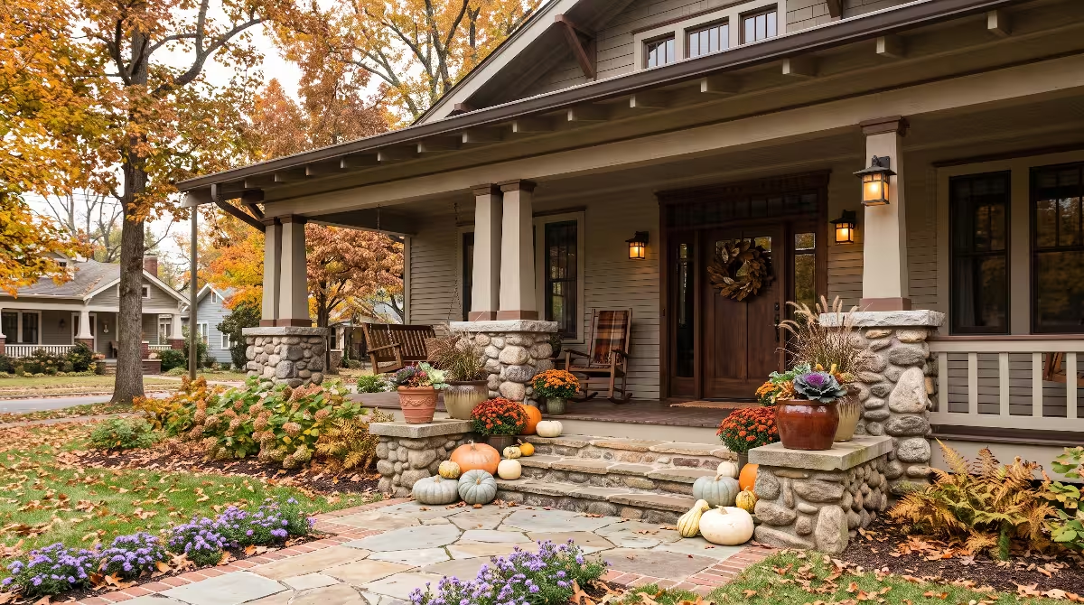
The Tennessee Dolomite and Oak palette honors the classic historic farmsteads and Craftsman homes that dot Washington and Sullivan counties. It pairs beautifully with local fieldstone foundations, large wrap-around porches, and exposed timber rafters.
- Dominant Body Color (60%): Smoked Taupe or Warm Mushroom. This versatile mid-tone has an LRV of roughly 33 to 38. It contains a balanced blend of gray, brown, and violet-slate undertones that mimic aged white oak bark.
- Architectural Trim Color (30%): Deep Walnut or Weathered Driftwood Stain. Rather than using opaque paint, this trim approach uses a rich, semi-transparent stain on natural wood trim, showcasing the real grain of the timber.
- Focal Accent Color (10%): Weathered Indigo Slate. A deep, smoky blue-gray with an LRV around 16 for the front door reflects the blue ridges of the distant mountains and the deep waters of Boone Lake.
These classic exterior color palettes create a timeless look that never goes out of style. They look especially attractive on homes with broad eaves, wide front porches, and natural stonework.
Comparative Reference Table for Regional Exterior Color Palettes
To help you compare these options side by side, review the specifications below:
| Palette Name | Main Siding (60%) | Trim and Fascia (30%) | Entry and Accents (10%) | Best Setting in Tri-Cities |
| Holston Ridge Canopy | Muted Moss Green (LRV ~30) | Deep Bronze Olive (LRV ~18) | Warm Chestnut Brown (LRV ~20) | Steep mountain ridges, heavily wooded parcels |
| Unaka Valley Slate | Weathered Shale Greige (LRV ~38) | Charred Charcoal (LRV ~12) | Earthy Persimmon Rust (LRV ~24) | Modern builds, exposed rocky hillsides |
| Appalachian Understory | Warm Spelt Ochre (LRV ~44) | Soft River Bone (LRV ~54) | Deep Laurel Green (LRV ~15) | Open pasture lots, river valleys, low meadows |
| Tennessee Dolomite and Oak | Smoked Taupe (LRV ~35) | Natural Walnut Stain | Weathered Indigo Slate (LRV ~16) | Historic farmsteads, lakefront lots, Craftsman homes |
Comparing these options demonstrates how varied exterior color palettes can be while still adhering to the core rules of natural integration.
Harmonizing Paint with Native Hardscapes and Biomaterials
Balancing Paint Tones with Tennessee Fieldstone and Limestone
Many homes in our area incorporate stone accents along foundations, retaining walls, and outdoor chimneys. When your home includes natural stone, the stone must act as your anchor when developing exterior color palettes. Paint can be changed easily, but stone is permanent.
East Tennessee fieldstone and limestone generally lean toward cool gray, slate blue, and pale charcoal, often with small veins of cream or rust. If you choose siding paint with a strong pink, peach, or yellow undertone, your paint will clash uncomfortably with the cool stone.
To achieve a seamless look, hold your paint chips directly against the stone in natural daylight. The best exterior color palettes pull their undertones straight from the stone itself. Look closely at the mortar joints and the subtle shadows on the rock face. Selecting a siding color that matches the mid-tone gray or tan in your masonry creates a home that feels solid and unified.
Complementing Crab Orchard Sandstone and Earth Browns
In addition to gray limestone, many regional homes feature Crab Orchard sandstone, quarried just down the road on the Cumberland Plateau. Crab Orchard stone is famous for its warm, variegated surface, showing shades of tan, buff, peach, rust, and brown.
If your home features Crab Orchard sandstone, your exterior color palettes must shift toward the warm side of the color wheel. Cool, modern grays look lifeless and awkward next to the sunny warmth of sandstone.
Instead, choose exterior color palettes featuring rich mushroom taupes, warm buckskin tans, or olive-tinted greens. These warm shades flatter the natural streaks of iron in the sandstone. When the paint and stone share a warm color temperature, the building appears grounded, solid, and inviting.
Integrating Natural Timber, Cedar Shakes, and White Pine Siding
Using natural, unpainted wood siding is one of the most effective ways to blend a home into the East Tennessee landscape. Eastern white pine, western red cedar, and native hemlock are popular building materials across the Southern Appalachians.
When combining natural wood with painted siding, your exterior color palettes must treat the timber as an active color player. Natural wood is not neutral; it contains strong yellow, orange, and golden-brown tones that shift as the wood weathers under the sun and rain.
If you are using semi-transparent exterior stains, make sure the stain color complements your painted trim and body colors. Clear penetrating sealers allow the natural grain of white pine or cedar to shine through, providing organic warmth. Balancing stained wood beams with painted fiber-cement siding gives you durable weather protection while keeping that authentic mountain character.
Aligning Roofing, Window Sashes, and Metal Accents
A complete exterior color plan includes more than just siding and trim paint. Your roof, window frames, gutters, and outdoor light fixtures represent massive visual surfaces that must align with your chosen exterior color palettes.
In our region, dark architectural shingles in weathered wood, charcoal, or dark brown provide an excellent neutral roof base. If you choose a metal roof, matte finishes are essential. Shiny galvanized metal can reflect intense glare across mountain valleys, irritating neighbors and breaking visual continuity. Matte bronze, slate gray, and dark forest green metal roofs blend smoothly into tree canopies.
For window frames and sashes, try to avoid bright white vinyl whenever possible. Dark bronze, dark brown, or black window sashes recede visually into the glass, making windows look like deep, open portals rather than plastic grids. When window frames recede, your exterior color palettes appear cleaner and far more sophisticated.
Common Questions Answered about Exterior Color Palettes
What exterior paint colors blend best with wooded lots and natural surroundings?
The colors that blend best with heavily wooded lots are desaturated, low-sheen earth tones with gray or brown undertones. Desaturated colors are colors that have had some of their bright, pure pigment muted by adding gray, brown, or their complementary color.
In a dense forest, pure green paint looks artificial because living leaves are constantly shifting in light, shadow, and breeze. High-performing exterior color palettes for wooded lots rely on olive greens, weathered moss, bark browns, warm slate grays, and deep taupes. These shades mirror the secondary colors found in the woods, such as tree bark, decaying leaf litter, lichen, and shaded rock ledges.
Furthermore, always use a flat or low-lustre satin sheen on wooded lots. Glossy paint reflects direct sunlight like a mirror, giving siding an unnatural plastic sheen. Flat and satin finishes absorb light softly, allowing your exterior color palettes to settle quietly among the trees.
What color house looks best in the Appalachian Mountains?
Houses that look best in the Appalachian Mountains are those that echo the colors of the mountain ridge horizon. In our region, distant ridges often appear as soft, smoky layers of charcoal, slate blue, and deep green-gray due to atmospheric moisture.
Because of this mountain backdrop, homes painted in mid-tone greiges, deep forest moss, weathered cedar, and soft charcoal sit gracefully on mountain slopes. When you look at an old mountain cabin made of hewn poplar logs and fieldstone, it looks right at home because its materials came directly from that mountain. Modern exterior color palettes can achieve this same look by choosing colors derived from native trees, soil, and rock.
Avoid high-contrast, stark-white paint schemes on mountain slopes. A bright white house on a mountain ridge stands out for miles, disrupting the natural skyline. Choosing exterior color palettes with moderate reflectance allows your home to be seen and appreciated without overwhelming the scenery.
Does dark exterior paint make a house hotter during humid Tennessee summers?
Yes, dark paint does absorb more thermal solar energy than pale paint, but modern building science can easily manage this heat gain. This is a common question from homeowners considering rich, moody exterior color palettes.
Black or dark charcoal siding can reach surface temperatures that are 40 to 60 degrees Fahrenheit hotter than white siding on a sunny July afternoon. If a home is poorly insulated, that surface heat can transfer through the exterior walls and into the living spaces, increasing your cooling costs.
However, if your home is built with modern continuous exterior insulation, proper wall cavity insulation, and a ventilated rainscreen gap behind the siding, dark exterior color palettes can be used safely without spiking energy bills. The rainscreen allows hot air to vent upward and escape before the heat ever reaches your home interior. If your home has older or minimal insulation, selecting mid-tone exterior color palettes with an LRV between 35 and 45 is a smart way to balance heat reflection with natural blending.
How do you pick trim colors when trying to blend a home with nature?
When blending a home with nature, the traditional rule of using bright white trim on every house should be set aside. Bright white trim creates high visual contrast that breaks the house into busy, fragmented outlines, drawing attention to every edge and corner.
To blend your home gracefully, pick trim colors that sit within two or three shades of your main body siding color. You can choose a monochromatic approach, where the trim is painted a slightly darker or slightly lighter version of the siding color. For example, if your siding is a warm lichen green, paint your trim a deep bronze olive.
This low-contrast approach creates a clean, tailored appearance. It frames your windows and rooflines with dignity while keeping the building silhouette soft. Successful exterior color palettes rely on this quiet harmony between siding and trim to create a relaxed, unified feel.
Step-by-Step Field Testing Protocol
The Four-by-Four Foot Test Board Standard
One of the costliest mistakes homeowners make is choosing paint colors based on a tiny two-inch paper swatch held up inside a brightly lit retail store. Fluorescent store lighting looks nothing like natural Appalachian sunlight, and a small swatch gives you zero sense of how a color behaves across a massive wall.
Before buying gallons of paint, you must test your exterior color palettes using large four-foot by four-foot test boards. You can purchase inexpensive sheets of primed drywall or smooth plywood from a local building supply store. Apply two full coats of your proposed body and trim colors onto these boards.
Never paint test swatches directly onto your existing exterior walls. The old color underneath will distort your perception of the new swatch, leading to inaccurate conclusions. Portable test boards allow you to move your exterior color palettes to different sides of your house, checking how the paint looks in full sun, partial shade, and deep shadow.
Testing Across Morning, Midday, and Evening Light
Once your test boards are painted, spend several days observing them at different hours. Sunlight shifts dramatically in color temperature throughout the day, and your exterior color palettes will react to every shift.
- Early Morning (8:00 AM): Morning sunlight in East Tennessee is warm, soft, and slightly golden. Look at your test boards on the eastern elevation. Do the colors look warm and clean, or do they appear washed out?
- Midday (1:00 PM): Direct midday overhead sunlight is bright, harsh, and cool. Check your boards on the southern elevation. Does your paint reflect uncomfortable glare, or does the moderate LRV keep the surface calm and visible?
- Late Afternoon and Twilight (6:30 PM): Evening light brings long shadows and rich amber hues. Check your western and northern elevations. As the sun dips behind the ridge, do your exterior color palettes retain their richness, or do they turn muddy and dark?
By testing your exterior color palettes across all three timeframes, you eliminate surprises and ensure you will love your home color at every hour of the day.
Accounting for the Famous Blue Haze of the Smoky and Holston Mountains
The Great Smoky Mountains and the Blue Ridge range get their famous name from the natural blue haze that hangs over their ridgelines. This haze is caused by volatile organic compounds released by millions of native trees, which scatter blue light across the atmosphere through a scientific process called Rayleigh scattering.
This blue atmospheric haze has a noticeable effect on how human eyes perceive color over distance. As objects move farther away across an East Tennessee valley, they naturally appear cooler, softer, and more blue-gray.
When you evaluate exterior color palettes, you must account for this phenomenon. If your house sits on a visible ridge seen from afar, paint colors with strong yellow or orange undertones will fight the ambient blue haze, looking jarring to viewers down in the valley. Conversely, exterior color palettes with soft slate, gray, or blue-green undertones harmonize with this natural atmospheric veil, making the home look like an organic part of the distant mountain view.
Summary and Professional Implementation
Working with Neighborhood HOA Rules and City Building Codes
Before you finalize your paint order, you must check with your local Homeowners Association (HOA) covenants or municipal design guidelines. Many planned communities in Johnson City, Kingsport, and Bristol have strict regulations regarding exterior paint colors.
Fortunately, many HOA architectural review committees in our area are actively moving away from sterile, cookie-cutter color schemes and welcoming natural, earth-toned exterior color palettes. When you submit your paint choices for committee approval, include a clear design narrative explaining why your chosen colors fit the site.
Provide the exact color names, manufacturer paint numbers, and LRV values for your body, trim, and accent selections. Explain how your exterior color palettes draw inspiration from native trees, limestone outcroppings, and local architecture. An organized, professional presentation makes it much easier for neighborhood boards to approve your custom color plan.
Choosing the Right Primers and Mildew-Resistant Paint Formulas
Selecting beautiful exterior color palettes is only half the battle; you must also ensure the paint holds up against East Tennessee weather. Our region experiences hot, humid summers, frequent rain showers, and freezing winter nights. This high humidity creates the perfect breeding ground for mold, mildew, and algae on exterior siding.
North-facing walls and homes surrounded by dense tree canopies are especially prone to mildew growth. When purchasing paint for your exterior color palettes, always select premium 100 percent acrylic latex formulas equipped with advanced mildewcides and UV-blocking technology.
Never skip proper surface preparation. Pressure wash your siding to remove all dirt, chalking, and fungal spores before painting. If you are painting bare wood or raw masonry, apply a high-adhesion exterior bonding primer first. Investing in high-grade paint ensures that your carefully chosen exterior color palettes remain vibrant, clean, and beautiful for ten to fifteen years.
Final Checklist for Selecting Exterior Color Palettes in East Tennessee
Before picking up your paint brush or signing off on your contractor contract, run your design through this final quality checklist:
- Survey the Immediate Landscape: Have you identified the dominant trees, exposed rocks, and soil colors on your specific lot?
- Verify the Light Reflectance Value: Does your primary body color fall within the recommended 22 to 42 LRV range for wooded settings?
- Check Undertones Against Hardscapes: Do your siding and trim undertones match the undertones of your brick, limestone, or sandstone features?
- Confirm the 60-30-10 Ratio: Is there a clear, balanced visual hierarchy between your 60 percent body siding, 30 percent trim, and 10 percent accent color?
- Build and Move Large Test Boards: Have you evaluated large four-foot test boards on all four sides of the house across morning, noon, and evening light?
- Coordinate Metal and Roof Finishes: Do your roof shingles, gutters, and window frames blend smoothly with your chosen paint colors?
- Select Premium Mildew-Resistant Formulas: Did you choose high-durability acrylic exterior paint formulated to withstand humid Appalachian summers?
When you follow these steps, you take the guesswork out of home design. By respecting the land, studying the light, and taking cues from nature, you can create exterior color palettes that celebrate your personal taste while honoring the timeless beauty of East Tennessee.