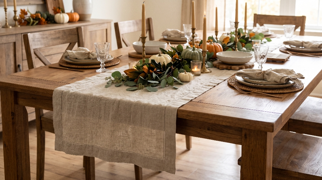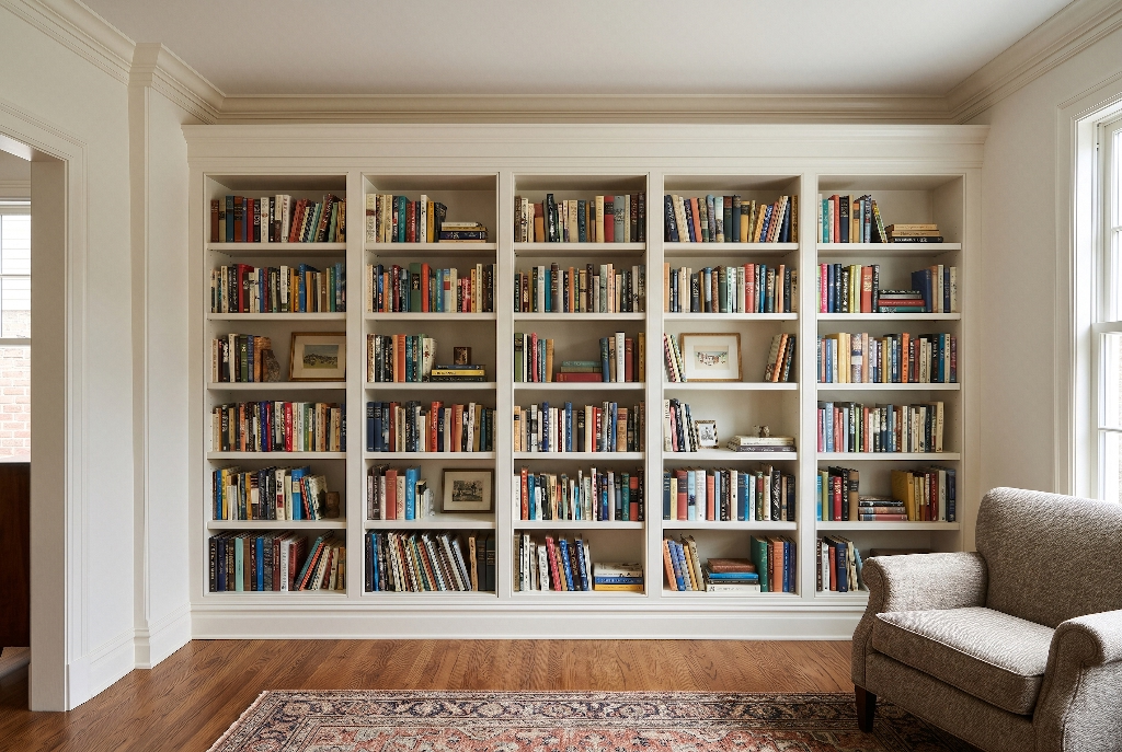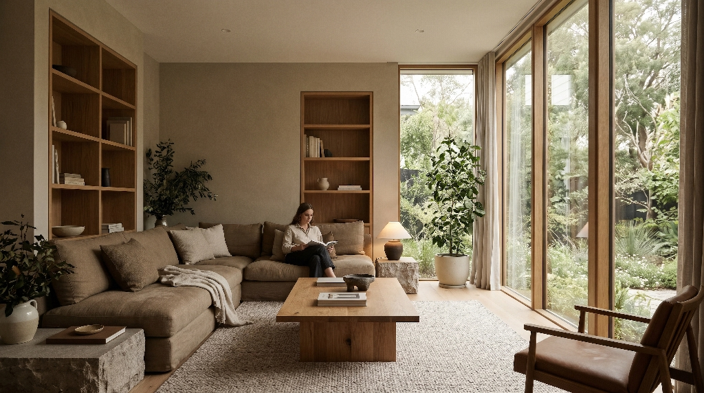


In interior design, biophilic color palettes are nature-derived color systems that bring the calming visual balance of the outdoors inside a building. Rather than relying on bright, synthetic hues, these palettes combine muted plant greens, soft water blues, mineral stone neutrals, and sun-warmed earth tones. Designers build these color schemes to mirror real natural landscapes, lower physical stress, and help people feel connected to the living world even when they spend most of their day indoors.
Modern humans spend roughly ninety percent of their lives inside offices, schools, and homes. When we surround ourselves with stark white drywall, harsh gray plastic, and neon digital screens, our brains stay on subtle alert. Thoughtful biophilic color palettes solve this problem by giving our eyes the exact visual cues they evolved to trust. When you walk into a room painted in soft sage green, warm limestone beige, and rich oak brown, your nervous system recognizes a safe, thriving habitat.
Great biophilic color palettes go far beyond picking a single pretty shade of green from a paint store display. True nature-inspired color design relies on four core engineering rules:
- Proportional Mirroring: Balancing colors in the same ratios found in outdoor landscapes, where sky, soil, and stone take up the most visual space.
- Matte Light Absorption: Choosing flat, chalky, or mineral finishes that scatter daylight softly instead of bouncing harsh glare like plastic.
- Diurnal Lighting Alignment: Matching paint undertones and light bulbs to the natural shift of sunlight from morning to night.
- Tactile Material Pairing: Blending paint colors with real wood grain, veined stone, clay, and living plants so the room feels authentic to both the eyes and the hands.
The Evolutionary and Physiological Science Behind Biophilic Color
To understand why biophilic color palettes work so well, we have to look at human biology. Long before humans lived in cities, our survival depended on reading the colors of our environment. Lush green leaves signaled fresh water and edible plants. Clear blue skies meant safe weather. Warm brown soil and gray rock meant solid shelter. Because our brains spent thousands of years decoding these natural colors, we process them with almost zero mental effort today.
How Natural Hues Regulate Cortisol and Cognitive Load
Every color your eyes see sends a fast electrical signal to your brain. High-saturation, artificial colors like bright neon yellow or electric red force your visual system to work overtime. Over several hours, that extra visual work raises your cognitive load, which is the amount of mental energy your brain burns just to process your surroundings. High visual stress triggers the release of cortisol, the body’s main stress hormone, while subtly raising your heart rate and blood pressure.
Well-crafted biophilic color palettes do the exact opposite. Natural hues sit near the middle of the visible light spectrum, where human eyes focus most easily. Studies in environmental psychology show that viewing soft greens, gentle blues, and warm earth tones slows down the nervous system. Cortisol levels drop, breathing deepens, and tired eyes recover faster from staring at computer monitors and phones.
Grounding Color in Terrapin Bright Green’s 14 Patterns of Biophilic Design
Leading researchers at the consulting firm Terrapin Bright Green organized nature-based architecture into a framework called the 14 Patterns of Biophilic Design. You can apply biophilic color palettes directly across the three main pillars of this framework:
- Nature in the Space: This pillar focuses on real, living changes inside a room. When sunlight moves across a soft mineral wall from morning to late afternoon, the paint color shifts gently from cool mist to warm gold, creating a living sense of time.
- Natural Analogues: This pillar uses colors, shapes, and materials that remind the brain of nature without bringing an entire forest indoors. Painting cabinets in deep moss green or laying down river-stone tile gives the mind familiar natural patterns to rest on.
- Nature of the Space: This pillar shapes how safe and open a room feels. Darker, cozy earth tones in a reading nook create a sense of refuge, which makes you feel protected. Lighter sky and sand tones in a main living area create prospect, giving you an open, airy feeling of freedom.
Biophilic Color Palettes vs. Standard Earthy Trends
Many homeowners confuse biophilic color palettes with standard earthy decorating trends. While both approaches use browns, greens, and tans, their goals are very different. A standard decor trend focuses only on how a room looks in a photograph. You might see a trendy room with shiny brown latex paint, synthetic polyester rugs, and harsh overhead lights. That room may look fashionable for a year, but it will still feel stuffy and tiring to live in.
Authentic biophilic color palettes focus on human health and sensory realism. Instead of flat, synthetic wall paint, a biophilic approach uses low-toxin mineral paints that let walls breathe. Instead of matching every item to a single flat paint chip, it layers subtle variations of tone found in real bark, moss, and stone. The result never goes out of style because it mirrors the timeless beauty of the natural world.
The Five Core Chromatic Families Beyond Just Leafy Green
A common question from homeowners is whether biophilic design is all about green. While green is certainly a star player, real ecosystems are full of diverse hues. Think about a coastal cliff, an autumn woodland, or a desert canyon at sunset. To build rich, balanced biophilic color palettes, designers draw from five distinct color families.
Botanical and Living Greens for Growth and Focus
Green is the primary color of chlorophyll, the molecule plants use to turn sunlight into energy. Because green sits right in the center of the human eye’s sensitivity range, it requires no lens adjustment to see clearly. Light, airy greens like soft celadon, pale sage, and new leaf moss feel refreshing and hopeful. A shade like Behr Healing Aloe (S400-3) brings a gentle, breezy lift to hallways and sunrooms.
Deeper botanical greens serve a different purpose. Shades like forest pine, olive leaf, and deep eucalyptus ground a room and encourage steady focus. A complex, gray-undertone green like Sherwin-Williams Pewter Green (SW 6208) feels rich and protective, making it ideal for libraries, dining rooms, and kitchen cabinetry.
Atmospheric and Aquatic Blues and Blue Space Theory
Water and sky make up the largest visual spaces on Earth. Researchers use the term Blue Space theory to describe how being near water, or even looking at water-inspired colors, lowers anxiety and improves mood. Pale, misty sky blues work wonders on ceilings and upper walls because they trick the eye into seeing open air above. Sherwin-Williams Misty (SW 6232) offers a soft, overcast sky tone that makes small rooms feel larger and calmer.
Deeper aquatic blues, such as river slate, fjord teal, and ocean indigo, slow down a racing mind. A deep coastal hue like Behr Ocean Boulevard (PPU13-10) works beautifully in bedrooms and quiet lounges, wrapping the space in the calm depth of deep water.
Grounding Earth Neutrals and Mineral Stones
Every thriving landscape rests on a foundation of soil, sand, clay, and rock. In biophilic color palettes, earth neutrals act as the quiet background that lets plants, wood, and natural light shine. Warm sandy beiges, soft mushroom taupes, and pale limestone grays keep a room from feeling sterile or cold.
For example, warm, organic browns like Pantone Mocha Mousse or versatile clay neutrals like Behr Even Better Beige (DC-010) mimic sun-warmed earth and river pebbles. These mineral tones hide everyday dust gracefully and connect effortlessly with wooden furniture, woven baskets, and stone floors.
Golden-Hour Warm Accents in Ochre, Terracotta, and Sunburst
Nature is rarely monotone. Even in a dense green forest, shafts of warm sunlight break through the canopy, and wild berries or autumn leaves spark visual interest. Golden-hour accents bring warmth, energy, and human hospitality into biophilic color palettes.
Colors like sun-baked terracotta, yellow ochre, raw sienna, and soft coral stimulate social warmth and healthy appetite. A muted sunrise shade like Behr Resort Sunrise (M180-2) adds instant cheer to a breakfast nook or entryway without overwhelming the senses like bright orange would.
Natural Contrast Anchors with Obsidian Black and Cloud White
Even the softest natural rooms need crisp definition so they do not look muddy or washed out. Nature provides contrast through deep shadows under rock ledges, charred wood after a forest fire, and bright white clouds against a stormy sky.
Using small touches of obsidian black or deep charcoal on window frames, light fixtures, or cabinet hardware frames your view of the outdoors just like a picture frame. On the bright end of the scale, soft cloud whites with warm cream or gray undertones bounce precious daylight deep into a home without creating the sterile glare of pure hospital white.
The Biophilic 60-30-10 Rule: Mirroring Natural Landscape Proportions
Choosing great colors is only half the battle. You also have to use them in the right amounts. If you paint every wall bright terracotta and cover the floor in deep teal, the room will feel chaotic rather than restful. To solve this, designers adapt the classic 60-30-10 interior design rule to match the exact visual balance of a natural landscape.
Why Ecosystem Ratios Matter
Step outside and look at a natural meadow or wooded hillside. Roughly sixty percent of your field of vision is made up of quiet background elements like the pale sky, dry grass, soil, or stone cliffs. About thirty percent consists of mid-ground features with stronger color, such as green tree canopies, rolling hills, or a lake. Only about ten percent of what you see consists of bright, eye-catching details like wildflowers, autumn leaves, or sparkling sunbeams.
When biophilic color palettes follow this exact 60-30-10 ratio, the human brain immediately feels at home. The large neutral background keeps your eyes relaxed, the mid-tone nature colors add depth and life, and the small warm accents keep the room from feeling boring.
Structural Breakdown of the 60-30-10 Ratio
Use the table below as a practical blueprint when planning the color balance of any room in your home or office.
| Proportion | Role in the Room | Natural Landscape Equivalent | Best Surfaces to Apply | Example Biophilic Colors |
| 60% Dominant | Quiet visual backdrop that sets the room’s brightness | Overcast sky, sandy soil, limestone cliffs, dry grasses | Main walls, ceilings, large area rugs, primary flooring | Warm limestone white, pale oat beige, soft mist gray, light sage |
| 30% Secondary | Mid-ground massing that adds color depth and character | Forest canopy, deep lake water, river clay, tree bark | Kitchen cabinets, sofas, accent walls, curtains, bedspreads | Moss green, slate blue, warm walnut brown, muted terracotta |
| 10% Accent | Focal points that spark warmth, energy, and visual interest | Wildflowers, golden-hour sunlight, copper minerals, deep shadows | Throw pillows, ceramics, metal hardware, art, living plants | Yellow ochre, unlacquered brass, obsidian black, vibrant leaf green |
By keeping the largest surfaces calm and reserving bold hues for smaller objects that are easy to swap out, you create a timeless foundation that stays soothing year after year.
Saturation, Undertones, and Lighting Dynamics: LRV and Kelvin
Two rooms painted with the exact same can of paint can look completely different depending on how light hits the walls. Mastering biophilic color palettes means understanding color saturation, paint undertones, and how both natural and artificial light interact with pigment.
Desaturated Tones vs. High-Chroma Pigments
In the color world, chroma refers to how pure or intense a color is. High-chroma colors are bright and vivid, like a stop sign or a neon highlighter. Desaturated colors have a touch of gray, brown, or cream mixed into them, making them softer and more complex.
Biophilic color specialist Claire Gaudion highlights how important tonal pitch and saturation are for human wellbeing. In nature, very few surfaces are pure, high-chroma color. Even a bright green leaf has hints of yellow, brown, and gray blended into it. For spaces meant for rest and recovery, such as bedrooms and living rooms, desaturated biophilic color palettes work best because they prevent visual overload. You can save slightly richer, higher-chroma accents for active spaces like kitchens, playrooms, or creative art studios where extra energy is welcome.
Light Reflectance Value (LRV) and Room Direction
Every professional paint swatch includes a number called Light Reflectance Value, or LRV. This number runs on a scale from 0 to 100 and tells you how much light a paint color bounces back into a room. Pure black has an LRV near 0 because it absorbs almost all light, while pure white has an LRV near 100 because it reflects almost all light.
To choose the right LRV and undertone, look at which direction your room’s windows face:
- North-Facing Rooms: These rooms never get direct sunlight. Instead, they receive cool, bluish light all day long. If you use a cool gray or icy blue paint here, the room will feel chilly and gloomy. Choose warm biophilic color palettes with yellow, cream, or red undertones and a medium-to-high LRV (between 55 and 75) to bring cozy warmth into the shadows.
- South-Facing Rooms: These rooms enjoy bright, warm sunlight from morning until late afternoon. Strong warm light can make yellow or beige walls look overly bright or orange. South-facing rooms are the best places to use cool sage greens, soft sky blues, and slate tones, because the warm sunshine balances out the cool paint undertones.
- East-Facing Rooms: These spaces get bright, warm morning sun and cool, soft shade in the afternoon. Soft greens and warm neutrals work well here, looking fresh at breakfast and calm by dinner.
- West-Facing Rooms: These rooms stay cool in the morning and flood with intense golden-orange light in the late afternoon. Balanced, desaturated earth tones and muted blues help tame the strong late-day glare.
Artificial Lighting and Circadian Color Rendering
Your relationship with biophilic color palettes does not stop when the sun goes down. Cheap, harsh LED light bulbs can ruin even the finest natural paint colors by casting a sickly blue or green tint across your walls.
For healthy indoor lighting that honors your body’s internal clock, known as your circadian rhythm, check two numbers on the light bulb box. First, look at the Color Rendering Index (CRI). Always choose bulbs with a CRI of 90 or higher, which means the light reveals the true, rich tones of wood, stone, and plant pigments just like natural sunlight does.
Second, pay attention to Kelvin (K), which measures light warmth. During daytime working hours, crisp white light around 3500K to 4000K keeps you alert and matches midday sun. In the evening, switch to warm-dimming bulbs between 2200K and 2700K. This golden candlelight glow signals your brain to produce melatonin for deep sleep while making earth tones look cozy and inviting.
Materiality and Surface Finish: Why Flat Paint Alone Fails
If you paint a smooth sheet of drywall with shiny latex paint, it will still look like a flat plastic wall, no matter how earthy the color is. Nature has almost no perfectly smooth, shiny surfaces. Real leaves, tree bark, river stones, and soil are full of texture, tiny shadows, and soft matte finishes. That is why material texture is essential to successful biophilic color palettes.
Matte, Chalk, and Limewash Finishes
High-gloss and semi-gloss paints create specular glare, which means they bounce sharp beams of light straight into your eyes. This glare strains your vision and makes walls look artificial. To give your rooms a true organic feel, choose ultra-matte, chalk, or mineral-based finishes.
Limewash and Roman clay plasters are among the best wall finishes for biophilic color palettes. Made from crushed limestone, clay, and natural mineral pigments, these finishes go onto the wall with a brush or trowel. As they dry, they create soft, cloud-like color shifts that look like aged European stone. Instead of reflecting harsh glare, limewash absorbs and scatters light gently across the room.
Fractal Patterns and Multi-Tonal Variation
When you look closely at a fern leaf, a snowflake, or the grain inside a wooden board, you are seeing fractals. Fractals are repeating natural patterns that look similar at both large and small scales. Neuroscientists have discovered that looking at natural fractal patterns reduces stress by up to sixty percent because our brains are wired to recognize them.
You can build soothing fractal variation into your biophilic color palettes through natural hardscape materials:
- Veined Natural Stone: Soapstone, travertine, and honed marble blend several soft grays, greens, and creams inside a single slab.
- Raw White Oak and Walnut: Unstained wood grain displays intricate waves and knots that add warm golden and brown tones without needing artificial dyes.
- Handmade Moroccan Zellige Tiles: Because these clay tiles are shaped and glazed by hand, each tile has slight variations in thickness and color, shimmering gently like sunlit water on a backsplash.
Living Metallic Finishes
Standard chrome and brushed nickel fixtures look the exact same ten years after you install them. While convenient, static metals do not reflect the natural world. Biophilic design celebrates a principle called Change and the Passage of Time, which reminds us that living things grow, weather, and age gracefully.
Pairing biophilic color palettes with living finishes like unlacquered brass, raw copper, and oil-rubbed bronze adds authentic richness. Over months and years, air and human touch cause these metals to darken and develop a warm, mottled patina. That evolving surface tells a story and harmonizes beautifully with mossy greens and warm earth tones.
Indoor Air Quality and Low-VOC Formulations
True biophilic design cares just as much about the air you breathe as the colors you see. Many conventional paints release Volatile Organic Compounds (VOCs) into your home for months after drying. These chemical fumes can cause headaches, eye irritation, and poor indoor air quality.
When shopping for paint to bring your biophilic color palettes to life, always specify zero-VOC, mineral-silicate, or plant-based paints. These healthier formulas use natural clay, chalk, and earth pigments, ensuring your walls support both your visual calm and your respiratory health.
Room-by-Room Biophilic Color Palette Blueprints
Every room in your home supports a different daily activity. A color scheme that helps you fall asleep in the bedroom might feel too sleepy for a busy kitchen. Below are five ready-to-use blueprints that match biophilic color palettes to the specific purpose of each space.
Living Rooms for Social Grounding and Indoor-Outdoor Flow
Your living room is where family and friends gather to unwind and connect. To create an open, welcoming atmosphere that bridges your indoor space with the yard outside, build your palette around a sunlit woodland clearing.
- 60% Dominant Base: Paint the walls in warm limestone off-white or soft pale oat beige with a matte finish.
- 30% Secondary Massing: Ground the space with raw white oak flooring, a woven jute or wool area rug, and a comfortable sofa upholstered in muted olive or moss green linen.
- 10% Focal Accents: Layer in handmade terracotta pottery, warm cognac leather pillows, blackened steel lamp bases, and large indoor plants like a fiddle-leaf fig or rubber tree.
Bedrooms for Deep Rest and Sleep Architecture
Your bedroom should act as a quiet sanctuary that signals your brain to slow down at the end of the day. Cooler, low-chroma biophilic color palettes work best here because they lower heart rate and mimic the peaceful colors of twilight and deep forest shade.
- 60% Dominant Base: Coat the walls and ceiling in desaturated eucalyptus green or dusty twilight slate blue to create a cocooning effect.
- 30% Secondary Massing: Dress the bed in breathable oatmeal linen sheets, a soft gray-brown waffle blanket, and warm American walnut nightstands.
- 10% Focal Accents: Add warm alabaster bedside lamps with 2200K warm-dimming bulbs, unlacquered brass drawer pulls, and a small potted snake plant on the dresser.
Kitchens for Vitality and Healthy Gathering
The kitchen is the energetic heart of the home, where nourishment, conversation, and creativity come together. Kitchens can handle slightly richer color contrast and warmer accents than bedrooms.
- 60% Dominant Base: Keep upper walls and ceilings crisp and bright with warm cloud white paint and honed travertine or pale quartzite countertops.
- 30% Secondary Massing: Paint lower perimeter cabinets in rich sage or muted forest green, and pair them with a natural butcher-block wood island.
- 10% Focal Accents: Bring in warmth with unlacquered brass or copper cabinet hardware, yellow ochre ceramic bowls, and bar stools woven from natural rattan or cane.
Bathrooms and Windowless Powder Rooms
Many homeowners wonder if they can use biophilic color palettes in a small or windowless bathroom. The answer is a resounding yes. In fact, dark, rich natural colors work magic in tight spaces without windows.
When you paint a tiny, windowless powder room bright white, the harsh shadows in the corners make the room feel like a cramped box. Instead, use the jewel-box approach. Wrap the walls and ceiling in deep, velvety forest green, moody river slate, or rich ocean indigo. Dark receding colors blur the sharp corners where walls meet, tricking your eye into feeling a sense of deep, mysterious space. Pair these deep walls with smooth river-pebble shower tiles, warm cedar bath mats, and humidity-loving Boston ferns or pothos vines.
Home Offices and Workspaces for Mental Focus
Staring at glowing spreadsheets and emails all day drains your mental energy fast, a problem psychologists call directed attention fatigue. Surrounding your desk with well-planned biophilic color palettes gives your eyes a natural resting place whenever you look up from your screen.
- 60% Dominant Base: Paint the wall behind your computer monitor in soft misty sky blue or pale lichen green so your peripheral vision stays relaxed.
- 30% Secondary Massing: Choose a solid ash or birch wood desk, warm cork pinboards, and linen window shades that filter harsh glare.
- 10% Focal Accents: Place a small tray of river stones, a matte black desk lamp, and a trailing green philodendron right within your line of sight.
How to Build Your Own Biophilic Color Palette in 5 Steps
You do not need an interior design degree to craft custom biophilic color palettes for your home. By following a simple, step-by-step process, you can pull colors straight from nature and test them safely before buying gallons of paint.
Step 1: Audit Your Local Biome Outside Your Window
Start by walking over to your windows and looking closely at the landscape right outside. Notice the exact shade of the tree bark, the color of the local soil or rocks, the greens of native shrubs, and the tone of the sky. When your indoor biophilic color palettes echo the exact colors outside your windows, your walls visually dissolve, making your home feel deeply connected to its real geographic location.
Step 2: Choose a Restorative Landscape Memory
If you live in a dense city apartment where your windows face brick walls or concrete streets, look inward instead. Think about a natural place where you always feel completely relaxed and energized. Maybe it is a foggy pine forest in the Pacific Northwest, a sunny limestone coast in the Mediterranean, or a red-rock desert canyon at dusk. Gather two or three favorite photos from that landscape and pull your dominant, secondary, and accent colors directly from the scene.
Step 3: Lock In Fixed Hardscape Materials First
One of the biggest mistakes homeowners make is picking wall paint before choosing flooring, tile, or countertops. Paint can be custom-tinted into thousands of shades, while natural wood and stone come in limited variations. Always select your fixed hardscape materials first, such as oak floorboards, slate tile, or granite counters. Lay those physical samples on the floor together so you can see their true undertones.
Step 4: Apply the 60-30-10 Ratio and Test Large Swatches
Once you have your hardscape samples, pick three or four paint swatches that follow the 60-30-10 ratio. Never paint tiny squares directly onto your existing wall, because your old wall color will trick your eyes. Instead, paint large poster boards (at least two feet by two feet) with two coats of each sample color. Move those boards around the room and observe them in bright morning sun, cloudy afternoon shade, and warm evening lamp light.
Step 5: Layer Living Greenery and Natural Scents
No color palette is truly biophilic until you add living elements. Once your paint and furniture are in place, bring in real indoor plants to supply authentic, shifting shades of chlorophyll green. Complete the sensory experience with natural textures like wool throws, woven baskets, and subtle natural scents from cedarwood or eucalyptus leaves.
Inclusive and Neurodiverse Biophilic Color Design
Human eyes and brains do not all process color in the exact same way. Truly thoughtful biophilic color palettes are designed to be welcoming, clear, and comfortable for every person who enters the space, regardless of how their vision or nervous system works.
Designing for Color Vision Deficiency (CVD)
Roughly one in twelve men and one in two hundred women experience some form of Color Vision Deficiency, commonly called color blindness. The most common form makes it hard to tell red and green apart. If you design a room using a terracotta red sofa against a sage green wall that has the exact same brightness level, someone with red-green color blindness will see two shades that blend together into a flat, muddy brown.
You can make biophilic color palettes accessible for everyone by layering strong luminance contrast, which means pairing light values with dark values. For instance, pair a very pale mist-green wall (high LRV) with a deep, dark espresso-brown leather chair (low LRV). Even if two colors look similar in hue to someone with CVD, the clear difference between light and dark keeps the room easy to navigate and visually rich.
Preventing Sensory Overload for Neurodivergent People
For people on the autism spectrum, individuals with ADHD, or anyone who experiences heightened sensory sensitivity, busy rooms with bright, clashing colors can trigger immediate anxiety and exhaustion. High-contrast geometric patterns and neon tones create constant visual noise that the brain cannot filter out.
Soft, desaturated biophilic color palettes act as a gentle sensory shelter. Using low-chroma earth tones, smooth tonal transitions, and matte finishes removes harsh visual edges and glare. When the visual environment stays quiet and predictable, neurodivergent occupants can focus, regulate their emotions, and feel deeply at ease in their own homes.
Common Biophilic Color Mistakes and How to Fix Them
Even with the best intentions, it is easy to miss the mark when translating nature into interior paint. Watch out for these four common mistakes and use the quick fixes below to keep your spaces authentic.
Mistake 1: Using Artificial, Neon, or Over-Saturated Greens
Many people hear “nature-inspired” and immediately buy bright kelly green, lime green, or mint paint. Those high-chroma greens look like candy or plastic turf rather than real plants, and they quickly tire out your eyes.
- The Fix: Look for complex greens that have gray, brown, or muted blue undertones mixed into them. If a paint color reminds you of sage leaves, dried moss, olive branches, or pine needles, you are on the right track.
Mistake 2: Ignoring Paint Sheen and Surface Flatness
Using glossy or semi-gloss paint across large walls ruins the soft, organic illusion of biophilic color palettes. Shiny walls highlight every drywall bump and bounce harsh reflections across the room.
- The Fix: Choose flat, matte, or velvet-matte finishes for walls and ceilings. Save durable eggshell or satin finishes strictly for baseboards, doors, and kitchen cabinets that need frequent wiping.
Mistake 3: Pairing Natural Colors with Cold Blue-White LEDs
You can spend days choosing the perfect warm mushroom beige and mossy green, only to watch them turn cold, flat, and lifeless the moment you flip on the light switch at night. This happens when rooms use harsh 5000K daylight bulbs that spike in blue wavelengths.
- The Fix: Replace cold bulbs with high-CRI (90+) warm LED bulbs rated between 2700K and 3000K in living areas and bedrooms. The warm light will bring out the rich golden and earthy undertones in your paint and wood furniture.
Mistake 4: Treating Color Alone Without Natural Shapes or Textures
Color is only one piece of the biophilic puzzle. A room painted in forest green and sand beige will still feel rigid if every piece of furniture is a sharp-cornered metal rectangle.
- The Fix: Soften your color scheme by adding biomorphic shapes and natural textures. Bring in a round wooden coffee table, an arched mirror, woven linen curtains, or curved ceramic vases to echo the gentle lines found in rivers, stones, and leaves.
Frequently Asked Questions About Biophilic Color Palettes
What are biophilic color palettes in interior design?
Biophilic color palettes in interior design are nature-inspired color schemes made up of muted plant greens, water and sky blues, mineral stone neutrals, and warm earth tones. Designers use these palettes to copy the balanced colors of real outdoor ecosystems, which helps lower stress hormones, ease eye strain, and make indoor rooms feel calm and restorative.
Is biophilic design expensive to implement with color?
No, using biophilic color palettes is one of the most affordable ways to transform a room. A couple of gallons of zero-VOC matte earth-tone paint, natural linen pillow covers, thrifted wooden furniture, and a few hardy houseplants like pothos or snake plants can completely shift how a space feels without requiring a major renovation.
What is the difference between biophilic design and sustainable design?
Sustainable design focuses on protecting the outside planet by reducing energy use, cutting waste, and choosing renewable resources. Biophilic design focuses on human health inside a building by connecting our nervous systems to nature. The two ideas overlap beautifully when you choose zero-VOC mineral paints and responsibly harvested wood that protect both people and the Earth.
How do biophilic colors improve productivity in a home office?
Staring at bright screens drains your brain’s ability to focus over time. Surrounding your workspace with soft, desaturated greens and sky blues lets your eyes relax effortlessly during micro-breaks. This natural visual rest lowers cortisol levels, reduces headaches, and restores your mental energy so you can stay focused and creative longer.
Can you mix warm and cool biophilic color palettes in the same room?
Yes, mixing warm and cool tones is actually the secret to making a room feel truly natural. Think of a rocky mountain stream surrounded by warm pine trees and golden sunlight. Pairing cool slate-blue walls or green foliage with warm oak floors, terracotta pots, and unlacquered brass hardware creates the exact balanced harmony we see outdoors every day.